the blog is currently on a competition hiatus, slightly longer than I had planned for but I'll soon be back, hopefully with some new insights. I'm afraid chances are they'll only concern things such as Finnish lakes and thoughts on how to place an elevator in a museum.
in the meantime here's yet another excellent article from the Observer, this time about Adolf Loos, and we can't really have too many of those now, can we? (I'm sorry I can't even find time to put in any additional links, but I've read quite a few good posts on Loos over at Fantastic Journal so I'd direct you that way for any further reading; oh and to Beatriz Colomina, of course)
Monday, February 21, 2011
Monday, January 17, 2011
a house is not a home
here's a slideshow of the Melnikov House, courtesy of the Observer, and here are some ruminations on architecture and change featuring said house from Fantastic Journal.
Tuesday, December 28, 2010
itchycoo park
 I like brutalism.
a good few architects like brutalism.
some non-architects like brutalism.
a huge amount of people use the word concrete in a derogatory way. for the sake of the argument I'll assume these people don't like brutalism, probably not even the brick brutalism of Klas Anshelm, GKC or Bernt Nyberg.
how is the architect supposed to relate to the views of the public?
how do you avoid making a bland populist design? should you avoid making a populist design? as whatever you do will be the part of the daily lives of thousands of people, what responsibility do you, as an architect, have to those people?
 some of these problems were dwelt upon a long time ago, as far back as in the 18th century but that time in writings on landscaping. there is a quote from sir Uvedale Price in Nikolaus Pevsner's Visual Planning and the Picturesque which quite clearly explains the difference between landscaping on the one hand and food and drinking on the other, but it could as well be used to discuss the differences between architecture on the one hand and art or music on the other:
'it can hardly be doubted, that what answers to the beautiful in the sense of tasting, has smootheness and sweetness for its basis, with such a degree of stimulus as enlivens, but does not overbalance those qualities; such, for instance, as in the most delicious fruits and liquors. take away the stimulus, they become insipid; increase it so as to overbalance those qualities, they then gain a peculiarity of flavour, are eagerly sought after by those who have acquired a relish for them, but they are generally less adapted to the general palate. this corresponds exactly with the picturesque; but if the stimulus be encreased [sic] beyond that point, none but depraved and vitiated palates will endure, what would be so justly termed deformity in objects of sight.'
 and that cuts straight to the heart of the matter, the issue of architecture's ubiquitiouness, how it is impossible to escape. it is no problem to me – a meagre whisky drinker at the best of times – if the person sitting next to me on the tube likes to drink whisky that tastes like pouring an entire fishing village down your throat, because I won't have to experience it myself. and for those amongst us who like our buildings a little rougher, a little more elemental, I guess we might be seen as having 'acquired a relish' for this. and once we're hooked we just go deeper and deeper until finding the ultimate trip: usually a stage involving Lewerentz's flower kiosk, or in partciularly bad cases Anshelm's extension to Lewerentz's last flat. but at times it can be wise to remember Price's words and try to put a restrain on ourselves. maybe try to be a little more populist and not let the roughness be all encompassing. because as beautiful as those buildings can be to the person looking for that kind of thing just as overpowering can they be to the person coming there just looking for a book, or to get a medical examination.
 I know we should design buildings able to stand for hundreds of years, and that during that time taste changes and they may become cherished by thousands – however rough or smooth they are – but I'd say that as a rule of thumb the closer a building is to everyday life the less challenging it should be. and the further removed from the matters of living and the closer it is to ritual and memory the rougher it can be. thus the only sorts of buildings entirely in the realm of architecture in the views of Adolf Loos – the monument and the tomb – can be as rough and uncompromising as the architect feels like.
come to think of it, if you subscribe to that view the Monument to Rosa Luxemburg and Karl Liebknecht would pretty much be the perfect monument. too bad the rest of Mies' work seems to be monuments too, and smooth ones at that ...
Tuesday, November 30, 2010
bricks and mortar
 after a visit to Lund last weekend I suddenly realised the striking similarities between Klas Anshelm's Town hall (1964) and Giancarlo De Carlo's Magistero (1976) in Urbino. having known about both buildings for years and having been very fascinated by De Carlo's since I first saw drawings of it I can't see why it took me this long to realise. even though De Carlo did have contact with Lund through ILAUD in the 80s I haven't found any information suggesting he was aware of Anshelm's building while designing the Magistero.
first and foremost they're both large brutalist buildings in the context of a medieval town* and secondly they're organised in a very similar way: the plan is one huge expanse into which multi-storey bodies housing specific programmes are set leaving the rest of the plan for circulation. in both cases the shapes for the main functions are clearly visible from outside, thus hinting at the functions inside. for his building De Carlo chose to work with non-directional plan shapes like circles and semi-circles while Anshelm deploys the directional mandorla shape for his two most important rooms – the assembly hall and the audtorium. in one way you could make an analogue comparison between the open floor plates of the buildings and the 'western' modernist idea of endless free-flowing space in city planning. in this comparison the multi-storey volumes are seen as buildings.**
 as well as similarities there are, of course, some major differences, especially in how these buildings relate to the surrounding city. De Carlo's project is built inside an old monastery where the existing brick perimeter walls are retained and thus camouflage the building when seen from the surrounding streets. in Lund Anshelm actually demolished buildings around the existing Town Hall and put a free-standing triangular building in their place. although the triangular shape doesn't align with the geometry of the surroundings it is very appropriate – creating some very nicely proportioned interstitial spaces when you walk around it – and doesn't feel like it ruptures the streetscape.
to the east of Anshelm's building there is a narrow office-building, separated from the Town Hall by a pedestrian path, which is also part of the original scheme and that Anshelm built against an existing firewall. while this side adapts to the constraints of the site the other two work to both separate the new building from the existing Town Hall and to act as a backdrop to the classical building when seen from a distance.
apart from being beautiful pieces of architecture in and of themselves I would say that both buildings serve to show alternative ways for modern buildings to relate to their surroundings without resorting to explicit mimicking. in the case of the Magistero you could claim that its camouflaging is a way of cheating but I would see it ass more of a trojan-horse manoeuvre in that it manages to slip radically modern accommodation into a sensitive medieval context without compromising either context or programme, and there are some modern windows and doors visible from the street that hint at the transformation of the space behind the walls. in the case of the Town Hall it neither simply adapts to the existing street-pattern nor is integrated in the building mass of a bigger city block, instead it is a free-standing volume – in full accordance with modernist dogma – but placed in such a way that it actually improves the existing streets and patterns of movement.
ps. I apologise for the lack of good drawings etc. but at the present all my books are in storage so those pdf:s are what I managed to find online.
* the similarities between brutalism and medieval architecture crept up just a while back in a comment to a post Owen Hatherley did on Southampton. see also the chapter on Scottish tower houses in Andrea Deplaze's Constructing Architecture where he compares their general layout and Louis Kahn's Phillips Exeter Academy Library.
** this 'western' conception of space was the main theme for Gunnar Asplund's inaugural lecture as professor at KTH (the Royal Institute of Technology) in Stockholm. a concept Asplund found in Oswald Spengler's The Decline of the West.
two sisters (pt. 2)
 O'Donnell + Tuomey and Bjarke Ingels seem to have more in common than I at first would have thought...
Wednesday, November 10, 2010
the road to ruin
 it seems there are, once again, plans to do something about Gillespie, Kidd & Coia's St. Peter's Seminary in Cardross.
I really hope something happens this time, it was a beautiful building once and it deserves better than to rot away behind a fence, slowly being overtaken by plants and grafitti.
and I must admit the romantic in me quite likes the suggestion of turning it into some kind of brutalist semi-ruin. as can be seen in online photos and films the robustness of the concrete and masonry gives the building a medieval air, like a strange distant relative to the tower houses abandoned in the middle of a forest. if you can harness that while clearing out all the rubble and making parts habitable you could be on to something good.
Monday, November 01, 2010
two sisters
 my last post made me reread Neave Brown's article The Form of Housing (Architectural Design,
September -76). this in turn had me thinking about two recent housing
projects which might, in different ways, be said to relate to Brown's
theories as expressed in that article and in his housing at Fleet Road and Alexandra Road in London.
my last post made me reread Neave Brown's article The Form of Housing (Architectural Design,
September -76). this in turn had me thinking about two recent housing
projects which might, in different ways, be said to relate to Brown's
theories as expressed in that article and in his housing at Fleet Road and Alexandra Road in London.first I should probably acknowledge that Douglas Murphy has already pointed out the similarities between BIG:s 8 House and the Smithsons' concept of streets in the sky.
I've mentioned one of the projects – the 8 House in Ørestad, Copenhagen – and the other is O'Donnell + Tuomey's Timberyard in Dublin. what these two projects – if very different in scale – have in common is the wish to relate the single dwelling to the surrounding city at the same time as it's relating to all the other dwellings that make up the project.
in his article Brown argues against the free-standing British post-war housing and its tabula-rasa approach to the surrounding city and for housing that acknowledges its context and adapts to existing street patterns. he thought that the concept of streets in the sky was a step in the right direction but that it wasn't going far enough, there were still 'a no-man's land' separating the different buildings and the city. according to him housing is characterised less by the differences between different types than by what they have in common and he wants to give back to housing 'the traditional quality of continuous background stuff, anonymous, cellular, repetitive, that has always been its virtue'. this was something he found in the traditional British terraced house. unfortunately that model could no longer handle the demands of modern society so it couldn't just be replicated, instead there had to be innovation to give these qualities to mass housing.
 Brown claims that 'it is the architect's job to structure the environment, incorporating in a single
form all the concepts that have a claim to inclusion. to make a
perceptible order requires more than an assembly of parts, more than the
recognition of meaningful relationships by the tactical arranging of
the pieces. it requires the integration of all the pieces into a single
gesture in which unity and interdependence can be recognized at whatever
level they are perceived'.
Brown claims that 'it is the architect's job to structure the environment, incorporating in a single
form all the concepts that have a claim to inclusion. to make a
perceptible order requires more than an assembly of parts, more than the
recognition of meaningful relationships by the tactical arranging of
the pieces. it requires the integration of all the pieces into a single
gesture in which unity and interdependence can be recognized at whatever
level they are perceived'.like Brown's own Alexandra Road both the 8 House and Timberyard excel at this integration of pieces into a single gesture. unfortunately things aren't as straight forward as they were back in Brown's day, no longer content with just being part of a collective we all want to be individuals. so when in Alexandra Road different kinds of apartments hide behind almost identical elevations both O'D+T and BIG go out of their way to make monolithic buildings in just a few materials but whose plan shape and more detailed massing create a diversity within that unity. to differentiate further both buildings, just as Alexandra Road, employ a sectional layering of different types of apartments. in the case of Timberyard it constitutes of both maisonettes and one-storey apartments and the layers in the vastly bigger 8 House are -from ground up: commercial space and offices, row houses along a pedestrian/cycle path, apartments and finally maisonettes entered off another outdoor path (for a further explanation from the architects watch this film).
the main part of accommodation at Alexandra Road stretches along a pedestrian path between the community centre in the east and Abbey Road in the west. to the sides of this brick-clad path the dwellings are stacked in two artificial ridges of concrete and glass, the northern eight storeys high and the southern four. all apartments are provided with outdoor space in form of a terraces and in some cases this terrace also functions as a front yard from which you reach the entrance.
 Timberyard
is located on Cork Street in central Dublin. that street has recently
been lined with fairly hideous and blandly modern apartment schemes with
retail space on the ground floors, the less that's said about them the
better. O'D+T opted to refuse the retail space asked for by the planners
and instead chose to let as many apartments as possible be entered
directly off the ground. to be honest I must say I kind of miss the
commercial element, not the hangar-like spaces from further up the road,
but a small office or shop facing Cork Street could have been quite
nice.
Timberyard
is located on Cork Street in central Dublin. that street has recently
been lined with fairly hideous and blandly modern apartment schemes with
retail space on the ground floors, the less that's said about them the
better. O'D+T opted to refuse the retail space asked for by the planners
and instead chose to let as many apartments as possible be entered
directly off the ground. to be honest I must say I kind of miss the
commercial element, not the hangar-like spaces from further up the road,
but a small office or shop facing Cork Street could have been quite
nice.just as Alexandra Road is built along a pedestrian path so is Timberyard focused on a semi-private courtyard set in brick (coincidentally the same material as the path in Alexandra Road). it is off this courtyard that most dwellings are entered and it is here that the communal space is located. to make the transition between public and private space less brutal all private entrances on the ground floor are set back slightly and the entrances provided with external benches. towards Cork Street the building line is pulled back somewhat with planters keeping the line of the footpath and a narrower path between the planters and the entrances to the apartments.
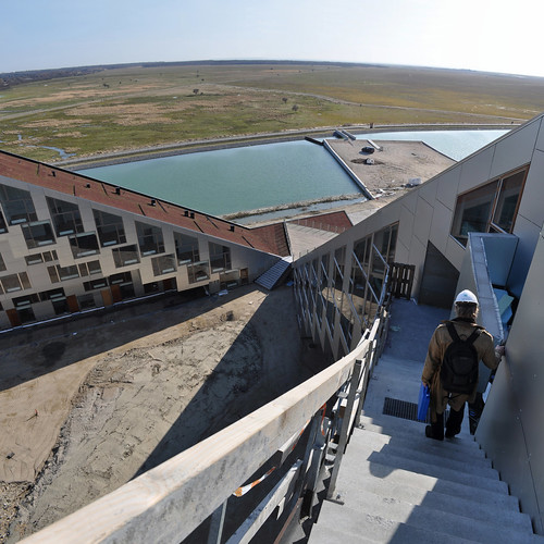
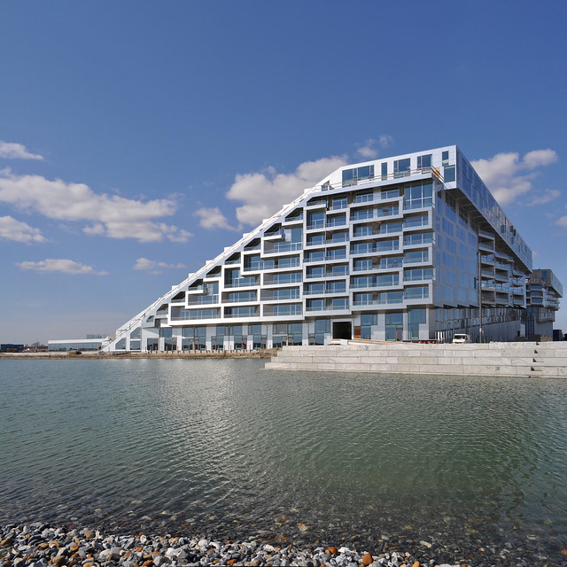 the
8 House is an aluminium-clad block at the very extreme of the new
Ørestad area of Copenhagen. at the moment it's even more remote than
what is intended as the economic crisis of recent years have slowed down
construction. this means that it and a neighbour are the only
buildings within a couple of hundred meters. having said that the
building makes the most of its edge condition with slopes and different
heights that aim to provide as many apartments as possible with views
out over the adjoining nature reserve.
the
8 House is an aluminium-clad block at the very extreme of the new
Ørestad area of Copenhagen. at the moment it's even more remote than
what is intended as the economic crisis of recent years have slowed down
construction. this means that it and a neighbour are the only
buildings within a couple of hundred meters. having said that the
building makes the most of its edge condition with slopes and different
heights that aim to provide as many apartments as possible with views
out over the adjoining nature reserve.as the lowest floors are taken up by commercial space and offices the different apartments can't have as direct a connection to the ground as in Timberyard or Alexandra Road but the architects have instead extended paths from the ground up on top of the offices and the so called row-houses are entered off these paths through a small front yard. the same applies for the maisonettes on the top two floors. just as in Timberyard this is done in the hope that it will create a feeling of community amongst the inhabitants. in-between these row-houses and the maisonettes are several floors of apartments clustered around stair shafts. that these are entered from the street on the ground floor should help to counter the risk of the surrounding streets becoming dead as soon as the businesses close for the day.
 comparing
the two schemes I can't help but to think that Timberyard is the more
successful. one of my problems with the 8 House is that even though it's
mostly built up right to the edge of the pavement the width of the road
coupled with a canal before reaching the closest neighbour make for a
very un-urban streetscape which I find unfortunate. having said that
it's hardly the architects' fault and achieving the gritty urban
character of a thousand-year-old part of the city in a yet-unfinished
district on virgin land is obviously hard.
comparing
the two schemes I can't help but to think that Timberyard is the more
successful. one of my problems with the 8 House is that even though it's
mostly built up right to the edge of the pavement the width of the road
coupled with a canal before reaching the closest neighbour make for a
very un-urban streetscape which I find unfortunate. having said that
it's hardly the architects' fault and achieving the gritty urban
character of a thousand-year-old part of the city in a yet-unfinished
district on virgin land is obviously hard.the 8 House does boldly continue the intentions of Alexandra Road, though, and on such a heroic scale it's hard not be impressed. it is also much better urbanistically than any of the previous PLOT/BIG projects in Ørestad, eschewing the piloti of the VM Houses and the Mountain Dwellings, but there is still something slightly odd about how it touches down. I'm not sure why, it might just be that the vertical aluminium fins prevent any diagonal views to the interior which makes the building feel more closed up than it actually is. Timberyard on the other hand feels like the end result of serious contemplation about a specific city and what can be done to fit modern accommodation into it without entirely rupturing the atmosphere of the place. there are still things that are problematic about it but it surely is a type of accommodation more suited to Dublin than any of the other new buildings along the rest of Cork Street.
official site for the 8 House
Alexandra Road on Modern Architecture London
acknowledgements:
photos of the 8 House by SEIER+SEIER
Subscribe to:
Posts (Atom)