Wednesday, July 18, 2012

people folk

update January 5, 2013 : I finally managed to scan the drawings so I've changed them to proper scans instead of the previous photos.

in a way that's becoming far too common I have recently been working a bit too much to actually manage to write anything, but here's a post I started ages ago and have finally finished:

detail of the façade of Folkets hus, Stockholm - Sven Markelius
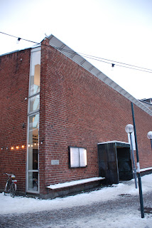
in the social-democratic heartland of Stockholm, on the northern side of Norra Bantorget, there stands a slick 1950's office building: a shiny black labradorite wall with hardwood windows – mid-century modernism at its most corporate. but looks deceive, the most extraordinary things are hidden behind that façade: a jumble of caves, stairs, bridges, cantilevering ledges and raking floors; it's a veritable Piranesian etching – well, as seen through a high-modernist prism, of course.

when viewed from outside there's really only one thing that's hinting at something unusual being found inside: at first-floor level a huge concrete canopy decorated by abstract sculptures extends out over the pavement. that canopy makes for a surprising addition to an office building.

in a way the building's sober façade could be read as an example of Adolf Loos' theories of masks. or rather it could if only the sober modernism had stopped at the front door to be replaced with something more thrilling and over the top inside, but this just isn't that kind of a building. what it is, though, is a building of much greater complexity than you might expect when first seeing it from afar, and that complexity is best illustrated by taking a look at the section:

section Folkets hus, Stockholm - Sven Markelius


behind that office building there lies two huge voids, one on top of the other. in a way the building is almost like something from OMA's late eighties: generic façades and heroically scaled construction used to create vast spaces where no-one would at first expect them.

front elevation of Folkets hus, Stockholm - Sven Markeliusthis is Folkets hus (1951-60) in Stockholm by Sven Markelius (1889-1972), professor of city planning at KTH and one of the architects on the board for the UN complex in New York. Markelius has been largely ignored for the last while, eclipsed by his contemporaries Gunnar Asplund and Sigurd Lewerentz. he was a friend of both Asplund's and Alvar Aalto's (whom he introduced to CIAM) and was one of the major Swedish architects during his life, not least because of his role as planning director in Stockholm. internationally he's probably best known for his own house, used as illustration of the AR-article 'The New Empiricism'. Markelius had lots of connections in the Social Democratic Party – for example he designed the house of Gunnar and Alva Myrdal – and I assume that is how he ended up with the commission for Folkets hus. I'd like to see Folkets Hus as his greatest building, it's at least his most odd and weird one.

rear elevation of Folkets Hus, Stockholm - Sven Markeliuswhen the association running Folkets hus decided to demolish its 1901 building and replace it with a bigger it tried to buy up as much of the surrounding land as possible. despite this the plot ended up at only 4 250 Sqm. because of the relatively small plot the two main spaces of the program – a 750-seat theatre and a 1 500-seat congress hall – had to be stacked on top of each other in the middle of the plot with offices making up the two blocks lining the surrounding streets. well, that isn't entirely true as part of the building along Wallingatan (at the northern side of the plot) is taken up by the fly-tower of the theatre - something which obviously renders an active relationship between the building and the street quite tricky. on the other hand the street frontage towards Barnhusgatan makes up for it somewhat as it houses the main entrance for the theatre and the conference hall and a separate entrance for the first-floor restaurant as well as two entrances for the offices on the floors above.

plans of theatre and banquetting hall, Folkets hus, Stockholm - Sven Markelius
it seems now might be the time to talk about those two voids – or caves as I called them in the beginning – the theatre and the conference hall. it's actually only the theatre that merits to be called cave-like: hidden away deep in both plan and section and with zigzagging walls of red brick there is something very earthbound about the space. the white walls and black ceiling studded with round lights of the conference hall on the other hand is reminiscent of an outdoor space in the city a star studded night, in that way related to the auditorium in Asplund's Skandia cinema from 1923. both the theatre and the conference hall play up the theatricality but aim for different associations: the dark cave with the opening through which you observe the world and the agora - the birthplace of democracy.

plans of ground floor and first floor, Folkets hus, Stockholm - Sven Markelius
connecting and flowing between these two spaces are two lobbies. the entrance lobby is the logistical heart of the building: straight ahead a gap gives a view of the theatre's foyer half a storey below while the rising ceiling hints at the route up to the conference hall. the stairs to reach these other rooms are situated at either side of the gap.* if you ascend the stairs you reach the corridor-like cloakrooms for the conference hall. sandwiched between the theatre and the conference hall the walls separating these cloakrooms double up as beams of immense dimensions making sure no columns are needed in either room.

plans of restaurant level and conference level, Folkets hus, Stockholm - Sven Markelius
the foyer for the conference hall is a wide and bright space lit from a south-facing roof-light along the back wall. having arrived here, looking at the interior wall of the theatre's fly-tower, the visitor is encouraged to make two ninety-degrees turns and end up facing the curving back wall of the conference hall. this foyer has some elements in common with the entrance foyer: the gap, a ledge-like balcony and the symmetry. the two rooms are clearly related and are key to making the building function in such an easy way as it does.

I began by claiming that Folkets hus was akin to but not quite adhering to the theories of Adolf Loos. while writing this post I've had to revise that opinion, it's entirely like a larger version of a Loos villa. all the elements are there: the elaborate section, the symmetry of all major rooms, the interior decoration meant to create different moods in different rooms, the meandering and staged communication  – even the tucked away communication for staff/workers.

I've liked Folkets hus ever since I first visited it during first year in college but for different reasons. what most attracts me at the moment is that it's such a complex building but that that complexity is not based on knowing references to historical precedents nor is it an over-complicated skin stretched over a banal stacking of identical floors, no it is a building with a simple and unassuming language used to render the actual complexity of the building as easy and intuitive as possible. it's a very confident building and it's basically the antithesis of almost anything that is being built in present-day Sweden, and for that reason alone well worth remembering and celebrating.

* this set up could be seen as an evolution of the gap in the procession in Markelius' first modernist public building – the Helsingborg Concert Hall – where visitors encounter a half-storey change of level that forces them to make a ninety degree turn up some stairs into the coat rooms before getting back to the main corridor to continue towards the hall (see the cut-away model here). though in this case, as there are two main halls, the continuous ceiling and the falling away floor leads to one hall each.

acknowledgements:
all drawings are taken from the magazine Arkitektur no. 6 -1961.

Sunday, April 29, 2012

monolith

entrance façade, Riksförsäkringsanstalten, Stockholm - Sigurd Lewerentz
a trip to Stockholm two weeks ago had me revisiting some of my favourite buildings from when I used to live there, as well as some of the buildings that have sprung up since I moved away. one of the buildings I went to revisit was Sigurd Lewerentz's severe, rationalist Riksförsäkringsanstalten (1930-32).

I guess I could claim that it was its very familiarity that had me snapping a few photos without really reflecting on the building. at the same time I haven't ever noticed what I saw when later flicking through the photos at home, so it might just be that I'm quite lousy at paying attention.

anyway, Riksförsäkringsanstalten is a monolithic building – a smooth white cube with a painted datum instead of any proper plinth. this white cube is perforated by square windows set deep within the wall creating dark recesses which reinforce the feeling of a homogeneous object with holes punched through it. but something isn't entirely what it seems, when studying the corner more closely you can see that the walls mightn't be as thick as you at first assume.

detail of corner, Riksförsäkringsanstalten, Stockholm - Sigurd Lewerentzat the corner – the place where a traditional building would most assert its solidity – Lewerentz starts playing games: on one side he leaves the part of the wall closest to the corner blank while on the other he pushes the window as close to the corner as is possible. thus the building that looks like a solid block when viewed from Sveavägen and Adolf Fredrik's churchyard is suddenly revealed to be something more akin to a cardboard model when viewed from one of the two side streets. of course it was standard procedure for the early modernists to undermine the solidity of corners – something perhaps started by the glazed corners in Gropius and Meyer's Fagus factory – but the difference this time is the play between the solidity of the monolith and the flimsiness of the cardboard model.

detail of corner, Schulhaus, Paspels - Valerio Olgiati
I have seen the same mannerist games employed in another seemingly solid building: Valerio Olgiati's School in Paspels (1998). the school has an even more restrained material palette than Riksförsäkringsanstalten: it's basically concrete, glass and a brownish metal that might be brass (but which might be something else entirely). when visiting the school it felt a lot like a concrete boulder sitting in an alpine field but at the corners the monolithic appearance is undermined in just the same way as at Riksförsäkringsverket. the main difference to the Lewerentz building is that at the school one window on each side is pushed right up to the corner. this means that neither side gives a more solid impression than the other, instead it depends on what floor you're focusing on.

these tricks are fairly subtle, though. in both cases I have noticed the corners not when actually visiting the buildings but instead while looking at photographs at a later time. it is this duality I find particularly interesting; both buildings are very much one object even if some aspects of them oppose that reading. this can be contrasted with two other buildings which both play with monumentality while at the same time undermining it. in these cases, though, there isn't this dissonance in the reading of the building, instead after the building is revealed as less solid than you at first think it never really regains its monolithic quality.

detail of corner, Lunds konsthall, Lund - Klas Anshelmthe first of these buildings is Klas Anshelm's Lunds Konsthall (1954-57) which employs the same trick but without the ambiguity. when you turn the corner the main façade is revealed as a thin brick slab by a window reaching all the way from the ground up to the roof. walking back to Mårtenstorget to view the front façade again you see a similar window at the left hand side of the building and realise it never actually was a building, instead it is a collection of building elements that just happen to be in the same place.

side façade, Casa del Fascio, Como - Giuseppe Terragni
the other is Giuseppe Terragni's Casa del Fascio (1932) in Como, just south of the Swiss-Italian border. this building has a very similar corner treatment to Riksförsäkringsanstalten but as the main façade also seems to be made up of thin layers the impression is very different. instead of a monolithic building revealed as being paper thin at the corner this is a building seemingly made up of several layers that coalesce into a single form.

Wednesday, January 11, 2012

poor old soul, pt. 1

'I do not need to draw my designs. A good architectural concept of how something is to be built can be written down. The Parthenon can be written down.' Adolf Loos, 1924

I've, once again, been reading up on Loos, and the above quote had me starting to dwell on a favourite issue of mine: CAD-programs, representation and the way people invest hopes and expectations for the evolution of architecture in the evolution of the programs.

I was born in 1981, my dad bought a Commodore 64 some time in the late eighties and my family got a PC some time around 1992-93. this means I have been using computers practically daily for twenty years and sporadically for years before that. I can see how they have sped up processes and how and why they have changed society profoundly: making sure useful information is there at our disposal at every conceivable time, making sure sharing information goes in an instant, also making sure we can always find something to distract us from the dullness of waiting.

but what I can't see, what I just can't comprehend, is how and what in the use of BIM-programs will revolutionise the building industry. I see these 60-year old men telling me about the fantastic advantages of using BIM, and I just look at them and wonder what exactly it is they think these programs do. and then I take another long look at them and wonder if they have forgotten that what we draw is being built by construction workers rather than robots? because we still need to send off drawings as they're the most useful tool to have on a building site. I guess it would be somehow different if what we were trying to build would be some extreme versions of Loos' Raumplan-concept but generally modern day accessibility guidelines makes that harder than it used to be.*

so mostly we're dealing with rectangular floors and rectangular sections built by humans who can guarantee the placement of a pillar down to an accuracy of +-25mm. and these men think we need to spend time building it all, every little part of the building, in three dimensions on our computer screens before it is actually constructed? obviously it is handy when sorting out where different pipes and such collide, but as a tool to create better buildings? wouldn't it just be simpler and cheaper to make sure construction workers are working more quickly and correctly?

as CAD-programs go I like Revit over Autocad (even for just drawing 2d-lines in), but in its current form it won't revolutionise the built environment, and it won't revolutionise the practice of building or architecture. and that's because the problems with today's buildings aren't really to do with problems of sharing information between consultants and builders - that is a minor issue, at the most - the problems with today's buildings are, as always, a lack of craftsmanship, a lack of money and - most importantly - a lack of ideas. and good ideas don't need 3-dimensional representations in computers, as Loos points out ideas can be written down.


*OMA have tried to update that concept to sometimes striking results as can be seen in their Dutch Embassy in Berlin and Casa da Musica in Porto, but these buildings are quite the exception in a world where stacked floors - offset by the same distance - reign virtually supreme.