I just found out Bobby Gillespie attended King's Park Secondary school, designed by Gillespie, Kidd and Coia. as one of GKC's finest buildings - the church of St. Bride's - is in East Kilbride where the Reid brothers grew up it seems there's a strong connection between GKC and the Jesus and Mary Chain at the time around Psychocandy.
if this is a good or a bad thing, and what it might have meant for the music I'm not entirely sure.
Thursday, June 23, 2011
Saturday, June 11, 2011
it's the same old song
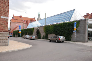
 last weekend I made another visit to the Malmö Konsthall (1971-75) by Klas Anshelm and was reminded of Adam Caruso's essay on the building. what I noticed more than during any previous visit was the relation of the different parts to the surroundings: the way the outside defines different zones in the interior. I guess it was the fact that the large rooflight wasn't covered this time as it has been on several of my earlier visits.
even if the interior has this rough semi-warehouse feel it is worth noting that the building was much more radical and anti-institutional when new. it was conceived as one volume where the café was placed right next to the art with no separating walls, the only permanent interior walls were the ones surrounding the lecture theatre. it was basically the same idea as for Peter Celsing's Kulturhuset in Stockholm, or Centre Pompidou/Beauborg in Paris (where the man responsible for the programme for Kulturhuset, Pontus Hultén, was the first director): big open and flexible spaces meant to be adapted for every new exhibition.
but the Malmö Konsthall has changed, a new connecting café and shop was built between the gallery and an old brick building in 1994. in this way the more mundane parts of the art experience have been separated from where art is presented, creating the highbrow atmosphere the gallery initially tried to eschew. walking into the new café it hit me this transformation can be characterised by the exterior walls. they're in fair-faced concrete with horizontal boardmarks; out in the open this feels mundane, almost rough, but in the café the former exterior wall is lit from a strip rooflight above giving the wall an almost sacral feel. it is exactly the same wall, with exactly the same treatment but the tiny difference of how it's lit gives it entirely different meanings and connotations. just in this way the gallery space has been given a new, more sacral and high-art feeling by the café and shop being moved out of there. it really is the same old space, but with a different meaning now those elements are gone.
 I'm not saying this is entirely wrong – I can imagine the presence of a café and chattering people creating problems when displaying certain kinds of art – but it is important to notice the difference, to notice how our attitudes have changed. nowadays we seem to think a work of art needs this kind of space to assert itself as art. just in the same way as religion might need a certain kind of space and somewhat arcane rituals and language to keep its air of holiness. if the goal of the avant-garde in the early parts of the 20th century was to break down the barriers between art and life throughout the last couple of decades we have instead tried to architecturally reinstate those boundaries, in this respect a lot has changed since the seventies.
Subscribe to:
Comments (Atom)
