Showing posts with label brutalism. Show all posts

Tuesday, May 30, 2017

to a poet

I'm currently working on a longer post on Bernt Nyberg and while doing some online research I happened on Arkdes' online archive of Nyberg's drawings and models. unfortunately so far few of the listed items have made it online but among the ones that have I found a drawing for the entrance stair and canopy of his Department of Anatomy and Histology Building (currently referred to as the Josephson Building and belonging to the Department of Arts and Cultural Sciences) in Lund from 1965. last year I went by the building for the first time and was immediately struck by two things: first the almost medieval relationship between the entrance stair tower and the neighbouring building to the south east and secondly the way the stair feels both haphazard in detail and entirely planned in the whole. not that the detailing feel haphazard in an unconsidered way, I probably should refer to it as loose fit instead; it is a whole with improvisations where everything is ruled by a main theme

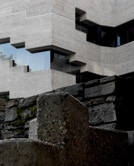
the first thing to say is that seen from the front the stair tower is entirely separated from the main building, both tectonically and in materiality: the main building shows a laconic acceptance of the programme in that it is a white-rendered brick building with repeated fenestration that doesn't in any way try to seem more interesting than it actually is while the stair tower seems to be a picturesque collage of slabs of different materials, not entirely unrelated to neoplasticism. there is an argument to be had that the ninety degrees indentions at the corners of the main block makes it seem like it too is composed of several slabs but even if that is the case the slabs the stair tower is composed of are much more pronounced.

moving down in scale we have the entrance porch and canopy. now we're suddenly quite far from neoplasticism but when looking closer at the different elements it is quite noticeable how everything is constructed from, well, not slabs but from distinctly flat elements: there are timber boards, flat steel bars, copper sheets etc. there is one obvious exception, the concrete stair, but that is also clearly separated from the building and belongs to the earth instead.

one significant characteristic of the porch – though one most users of the building probably won't notice until after a long while, if they notice it at all – is that the whole thing is cantilevered off the stair tower. it would be so incredibly easy to just put some short legs under the construction but there are none. the only places it actually touches down are the handrail of the stair – added by Nyberg in 1967 – and the ramp at the back which wasn't added until 1983, after Nyberg's passing, to increase accessibility. so if you take a look at the drawing there is actually no point of the porch that ever touch down.

after a while you realise that the fact that the construction doesn't touch down is symptomatic as none of the major elements of the porch actually connect to each other either; they're always connected by secondary elements or interrupted by some other part. so you have a thin flat timber roof that rests atop T-shaped steel beams (ostensibly made from two flat steel bars connected at a right angle) but before the roof meets up with the wall of the stair tower it's interrupted by a copper gutter resting on the same beams (and which at the front lets the water just fall straight onto the ground but at the back is connected to a rectangular drainpipe). in the same way the T-shaped beams aren't actually resting on the paired uprights at the edge of the porch, that would be way too obvious a construction, instead the beams lie on top of steel brackets made of folded flat steel bars and these brackets also serve as the distances for the paired uprights. and the original railing, a flat steel bar folded into the shape of a rectangle, is connected to the uprights by the same kind of bracket, only smaller. the floor of the porch is made from timber boards resting on further T-shaped beams which are in turn resting on the steel cantilevers connected to the stair tower. originally the Ts, and the boards along with them, made a ninety-degree turn at the back folding up to make a waist-high back wall where the ramp now starts.

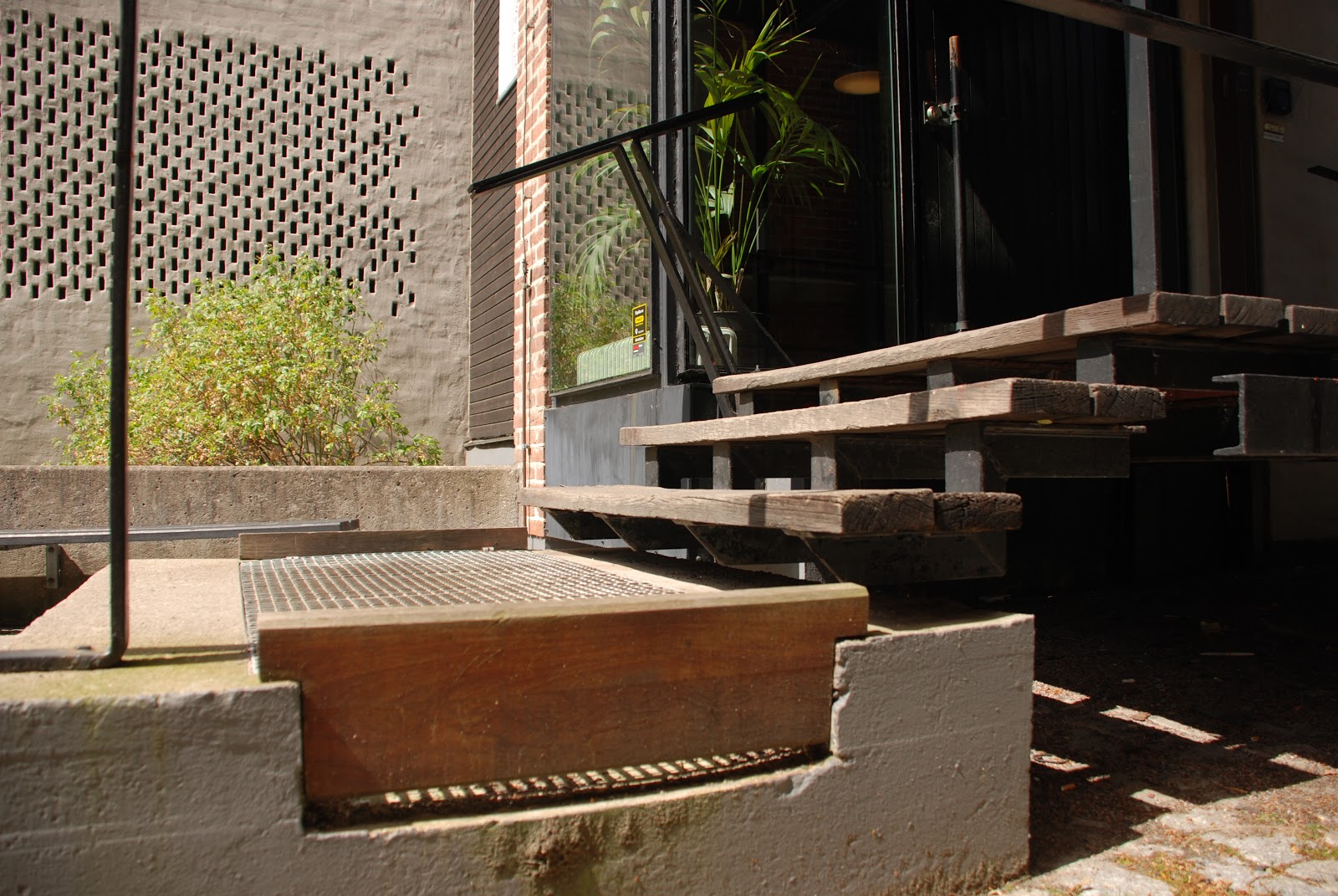
as I said the only part of the construction, related to Nyberg, that touches down is the handrail from -67 and that's only with one upright, and in a very odd way: the upright isn't just secured on top of the stair but turns ninety degrees and follows the stair to spill down the riser like some kind of slow-moving liquid.

this became a lot longer than I had at first intended but since my first visit I have been fascinated by how just a few materials – timber, steel, copper – in even fewer shapes – basically a rectangular cross-section of different proportions – can combine in unexpected ways to create what can only be considered some kind of built poetry.

acknowledgements and further info:
most information on dates and the different alterations are from Lennart Lundberg's 2003 thesis in art history Arkitekten Bernt Nyberg och modernismen –en studie av konst- och musikvetenskapsinstitutionens byggnad "Josephson" vid Lunds universitet which although it, from the perspective of a practising architect, has some flaws is useful on the timeline of the building and the different changes since its completition

Saturday, June 11, 2011

it's the same old song

Malmö Konsthall, Malmö - Klas Anshelmlast weekend I made another visit to the Malmö Konsthall (1971-75) by Klas Anshelm and was reminded of Adam Caruso's essay on the building. what I noticed more than during any previous visit was the relation of the different parts to the surroundings: the way the outside defines different zones in the interior. I guess it was the fact that the large rooflight wasn't covered this time as it has been on several of my earlier visits.

even if the interior has this rough semi-warehouse feel it is worth noting that the building was much more radical and anti-institutional when new. it was conceived as one volume where the café was placed right next to the art with no separating walls, the only permanent interior walls were the ones surrounding the lecture theatre. it was basically the same idea as for Peter Celsing's Kulturhuset in Stockholm, or Centre Pompidou/Beauborg in Paris (where the man responsible for the programme for Kulturhuset, Pontus Hultén, was the first director): big open and flexible spaces meant to be adapted for every new exhibition.

but the Malmö Konsthall has changed, a new connecting café and shop was built between the gallery and an old brick building in 1994. in this way the more mundane parts of the art experience have been separated from where art is presented, creating the highbrow atmosphere the gallery initially tried to eschew. walking into the new café it hit me this transformation can be characterised by the exterior walls. they're in fair-faced concrete with horizontal boardmarks; out in the open this feels mundane, almost rough, but in the café the former exterior wall is lit from a strip rooflight above giving the wall an almost sacral feel. it is exactly the same wall, with exactly the same treatment but the tiny difference of how it's lit gives it entirely different meanings and connotations. just in this way the gallery space has been given a new, more sacral and high-art feeling by the café and shop being moved out of there. it really is the same old space, but with a different meaning now those elements are gone.

Malmö Konsthall, Malmö -ö Klas AnshelmI'm not saying this is entirely wrong – I can imagine the presence of a café and chattering people creating problems when displaying certain kinds of art – but it is important to notice the difference, to notice how our attitudes have changed. nowadays we seem to think a work of art needs this kind of space to assert itself as art. just in the same way as religion might need a certain kind of space and somewhat arcane rituals and language to keep its air of holiness. if the goal of the avant-garde in the early parts of the 20th century was to break down the barriers between art and life throughout the last couple of decades we have instead tried to architecturally reinstate those boundaries, in this respect a lot has changed since the seventies.

Thursday, May 26, 2011

neu!

I have previously written about De Carlo's Magistero - a building I've been fascinated with for years now - and how it's a reworking of a medieval structure into a functioning modern building. it feels like it's time to revisit that topic, though from a different angle.

Bensberg town Hall, outside Cologne - Gottfried Böhm, photo by SEIER + SEIERlet's start with Gottfried Böhm: last summer he seemed to be everywhere. to be honest 'everywhere' mostly consisted of someone at work mentioning him once and me reading about his Bensberg Town Hall (1962-67) in Peter Blundell-Jones and Eamonn Canniffe's Modern Architecture Through Case Studies 1945-1990 (a book I bought mostly because it featured said Magistero). the Town Hall is a concrete building set within the remains of a medieval castle and was so intriguing that the next time I found myself in a well-stocked bookshop I ended up buying a monograph on Böhm.

entrance to Hotel and Restaurant, Bad Godesberg outside Bonn - Gottfried Böhm, photo by TRiverthrough the monograph I found out not only that Böhm had done other projects in a similar vein – the first seems to be a hotel and restaurant in Bad Godesberg outside Bonn (1959-68) – but also that he designed a chapel on the site of Peter Zumthor's Kolumba Museum (1997-2007), a chapel now incorporated into the new museum. so let's take a look at these buildings and their attitudes to adaptations of older buildings*:

in Bad Godesberg** Böhm unceremoniously places his modern additions on and in-between existing wall fragments. while the original walls are of stone Böhm's additions are in fair-faced concrete, neither entirely breaking with nor blending in with the old ruins. in this way Böhm creates not a brand new building but an amalgamation: the new spaces are partly created by what built matter was already on the site. at the same time Böhm adhered to the often used modernist strategy of clearly separating the existing building and any new interventions: what is modern is undoubtedly modern: there is no mimicking of traditional forms or detailing.

Böhm used the same approach in his competition-winning entry for the Bensberg Town Hall***, although in a more extreme version. the old castle in Bensberg had been a ruin since the Thirty Years' War but in the mid-eighteenth century the ruin was converted into a monastery and later on also into a hospital. Böhm decided to get rid of these fairly recent structures and to only keep the medieval remains. in this way he had a podium of lower walls as well as one higher fragment curving around and protecting part of the site. the higher part of the wall ended in a high tower with a slate roof which he also retained. Böhm placed the council chamber against the higher wall fragment while placing all other accommodation in a C-shaped pattern around a courtyard open to the town. in this way the position of the council chamber, the complex's most important room, was shown to the surrounding town by the tower and from the building's courtyard by extensive glazing, two stories high.

detail of Bensberg town Hall, outside Cologne - Gottfried Böhm, photo by SEIER + SEIERonce again the interventions are modern, to say the least. the fenestration is in the form of ribbon windows thus clearly breaking with the romanesque windows of the original building (some of which were re-created from archaeological findings). in the more important parts - the stair tower and on the ground floor - the glazing is frameless which must be considered very advanced for the mid 60s.

just as in Bad Godesberg the junctions between new and old parts are not expressed in any particular way, rather new and old are juxtaposed with concrete simply sitting atop older stone walls.

after the allied bombing of Cologne during the Second World War most parts of the church of St. Kolumba had been demolished but left standing was a medieval statue of the Virgin Mary. in 1948 Böhm built a chapel to protect the statue and in 1956 he added a sacristy along with a boundary wall to the monastery just north of the chapel.

detail of Kolumba Museum, Cologne - Peter Zumthor and Gottfried Böhm, photo by Claus Moserin 1997 there was a competition for a new diocesan arts museum on the site of the old church where Böhm participated. Böhm didn't win, instead the victory went to Peter Zumthor. in a move very reminiscent of Böhm Zumthor's proposal places new walls directly on to the structures already present on the site, be they medieval masonry or Böhm's post-war concrete walls. these new walls are made of a brick Zumthor developed especially for the project: a thin long slab hinting at both old Roman brickwork and at the masonry employed in his Therme Vals. in a way these brick walls become a mediation between the different periods already represented on the site: the detailing of the brickwork is very abstract hinting at modernity but in no way does it seem more modern than Böhm's 1956 concrete walls, rather the opposite. in this I think Zumthor has managed to strike a perfect note, the additions are clearly marked out as such but also function as a backdrop highlighting both the ruinous fragments and Böhm's structures as parts of special interest.

though Böhm himself have expressed reservations against Zumthor's project it seems the major difference between Kolumba and the Böhm projects I've discussed above is the fact that Böhm was still alive when Zumthor's project was built. apart from that it uses pretty much the same strategies regarding retention and interventions on sites already rich with history. I guess if there's one major difference it is that where Böhm at Bad Godesberg and Bensberg create a true collage from two equally important parts – what's existing and what's new – Zumthor's new structure is so much larger and more important than the older parts it feels as if it's about to devour them. if this is down to a different attitude or just a reflection of the size of the programme he had to fit on to the site I'm not sure.


* I probably should mention I haven't visited any of the buildings but rather have to rely on drawings, photos and other people's accounts.

** some more photos of Bad Godesberg can be found here


***and some very good ones of Bensberg can be found here


acknowledgements:
both of the beautiful photos of Bensberg are stolen from SEIER+SEIER, photo of Bad Godesberg by TRiver
photo of Kolumba by Claus Moser

Tuesday, December 28, 2010

itchycoo park

St. Bride's, East Kilbride - Gillespie, Kidd and CoiaI like brutalism.

a good few architects like brutalism.

some non-architects like brutalism.

a huge amount of people use the word concrete in a derogatory way. for the sake of the argument I'll assume these people don't like brutalism, probably not even the brick brutalism of Klas Anshelm, GKC or Bernt Nyberg.

how is the architect supposed to relate to the views of the public?

how do you avoid making a bland populist design? should you avoid making a populist design? as whatever you do will be the part of the daily lives of thousands of people, what responsibility do you, as an architect, have to those people?

Berkely Library, Trinity College, Dublin - Ahrends, Burton and Koraleksome of these problems were dwelt upon a long time ago, as far back as in the 18th century but that time in writings on landscaping. there is a quote from sir Uvedale Price in Nikolaus Pevsner's Visual Planning and the Picturesque which quite clearly explains the difference between landscaping on the one hand and food and drinking on the other, but it could as well be used to discuss the differences between architecture on the one hand and art or music on the other:

'it can hardly be doubted, that what answers to the beautiful in the sense of tasting, has smootheness and sweetness for its basis, with such a degree of stimulus as enlivens, but does not overbalance those qualities; such, for instance, as in the most delicious fruits and liquors. take away the stimulus, they become insipid; increase it so as to overbalance those qualities, they then gain a peculiarity of flavour, are eagerly sought after by those who have acquired a relish for them, but they are generally less adapted to the general palate. this corresponds exactly with the picturesque; but if the stimulus be encreased [sic] beyond that point, none but depraved and vitiated palates will endure, what would be so justly termed deformity in objects of sight.'

the Barbican, London - Chamberlin, Powell and Bonand that cuts straight to the heart of the matter, the issue of architecture's ubiquitiouness, how it is impossible to escape. it is no problem to me – a meagre whisky drinker at the best of times – if the person sitting next to me on the tube likes to drink whisky that tastes like pouring an entire fishing village down your throat, because I won't have to experience it myself. and for those amongst us who like our buildings a little rougher, a little more elemental, I guess we might be seen as having 'acquired a relish' for this. and once we're hooked we just go deeper and deeper until finding the ultimate trip: usually a stage involving Lewerentz's flower kiosk, or in partciularly bad cases Anshelm's extension to Lewerentz's last flat. but at times it can be wise to remember Price's words and try to put a restrain on ourselves. maybe try to be a little more populist and not let the roughness be all encompassing. because as beautiful as those buildings can be to the person looking for that kind of thing just as overpowering can they be to the person coming there just looking for a book, or to get a medical examination.

Flower kiosk, Östra Kyrkogården, Malmö - Sigurd LewerentzI know we should design buildings able to stand for hundreds of years, and that during that time taste changes and they may become cherished by thousands – however rough or smooth they are – but I'd say that as a rule of thumb the closer a building is to everyday life the less challenging it should be. and the further removed from the matters of living and the closer it is to ritual and memory the rougher it can be. thus the only sorts of buildings entirely in the realm of architecture in the views of Adolf Loos – the monument and the tomb – can be as rough and uncompromising as the architect feels like.

come to think of it, if you subscribe to that view the Monument to Rosa Luxemburg and Karl Liebknecht would pretty much be the perfect monument. too bad the rest of Mies' work seems to be monuments too, and smooth ones at that ...

Tuesday, November 30, 2010

bricks and mortar

Town hall in Lund - Klas Anshelmafter a visit to Lund last weekend I suddenly realised the striking similarities between Klas Anshelm's Town hall (1964) and Giancarlo De Carlo's Magistero (1976) in Urbino. having known about both buildings for years and having been very fascinated by De Carlo's since I first saw drawings of it I can't see why it took me this long to realise. even though De Carlo did have contact with Lund through ILAUD in the 80s I haven't found any information suggesting he was aware of Anshelm's building while designing the Magistero.

first and foremost they're both large brutalist buildings in the context of a medieval town* and secondly they're organised in a very similar way: the plan is one huge expanse into which multi-storey bodies housing specific programmes are set leaving the rest of the plan for circulation. in both cases the shapes for the main functions are clearly visible from outside, thus hinting at the functions inside. for his building De Carlo chose to work with non-directional plan shapes like circles and semi-circles while Anshelm deploys the directional mandorla shape for his two most important rooms – the assembly hall and the audtorium. in one way you could make an analogue comparison between the open floor plates of the buildings and the 'western' modernist idea of endless free-flowing space in city planning. in this comparison the multi-storey volumes are seen as buildings.**

19th century map of Lundas well as similarities there are, of course, some major differences, especially in how these buildings relate to the surrounding city. De Carlo's project is built inside an old monastery where the existing brick perimeter walls are retained and thus camouflage the building when seen from the surrounding streets. in Lund Anshelm actually demolished buildings around the existing Town Hall and put a free-standing triangular building in their place. although the triangular shape doesn't align with the geometry of the surroundings it is very appropriate – creating some very nicely proportioned interstitial spaces when you walk around it – and doesn't feel like it ruptures the streetscape.

to the east of Anshelm's building there is a narrow office-building, separated from the Town Hall by a pedestrian path, which is also part of the original scheme and that Anshelm built against an existing firewall. while this side adapts to the constraints of the site the other two work to both separate the new building from the existing Town Hall and to act as a backdrop to the classical building when seen from a distance.

apart from being beautiful pieces of architecture in and of themselves I would say that both buildings serve to show alternative ways for modern buildings to relate to their surroundings without resorting to explicit mimicking. in the case of the Magistero you could claim that its camouflaging is a way of cheating but I would see it ass more of a trojan-horse manoeuvre in that it manages to slip radically modern accommodation into a sensitive medieval context without compromising either context or programme, and there are some modern windows and doors visible from the street that hint at the transformation of the space behind the walls. in the case of the Town Hall it neither simply adapts to the existing street-pattern nor is integrated in the building mass of a bigger city block, instead it is a free-standing volume – in full accordance with modernist dogma – but placed in such a way that it actually improves the existing streets and patterns of movement.


ps. I apologise for the lack of good drawings etc. but at the present all my books are in storage so those pdf:s are what I managed to find online.

* the similarities between brutalism and medieval architecture crept up just a while back in a comment to a post Owen Hatherley did on Southampton. see also the chapter on Scottish tower houses in Andrea Deplaze's Constructing Architecture where he compares their general layout and Louis Kahn's Phillips Exeter Academy Library.

** this 'western' conception of space was the main theme for Gunnar Asplund's inaugural lecture as professor at KTH (the Royal Institute of Technology) in Stockholm. a concept Asplund found in Oswald Spengler's The Decline of the West.

Wednesday, November 10, 2010

the road to ruin

it seems there are, once again, plans to do something about Gillespie, Kidd & Coia's St. Peter's Seminary in Cardross.

I really hope something happens this time, it was a beautiful building once and it deserves better than to rot away behind a fence, slowly being overtaken by plants and grafitti.

and I must admit the romantic in me quite likes the suggestion of turning it into some kind of brutalist semi-ruin. as can be seen in online photos and films the robustness of the concrete and masonry gives the building a medieval air, like a strange distant relative to the tower houses abandoned in the middle of a forest. if you can harness that while clearing out all the rubble and making parts habitable you could be on to something good.