Showing posts with label lund. Show all posts

Tuesday, May 30, 2017

to a poet

I'm currently working on a longer post on Bernt Nyberg and while doing some online research I happened on Arkdes' online archive of Nyberg's drawings and models. unfortunately so far few of the listed items have made it online but among the ones that have I found a drawing for the entrance stair and canopy of his Department of Anatomy and Histology Building (currently referred to as the Josephson Building and belonging to the Department of Arts and Cultural Sciences) in Lund from 1965. last year I went by the building for the first time and was immediately struck by two things: first the almost medieval relationship between the entrance stair tower and the neighbouring building to the south east and secondly the way the stair feels both haphazard in detail and entirely planned in the whole. not that the detailing feel haphazard in an unconsidered way, I probably should refer to it as loose fit instead; it is a whole with improvisations where everything is ruled by a main theme

the first thing to say is that seen from the front the stair tower is entirely separated from the main building, both tectonically and in materiality: the main building shows a laconic acceptance of the programme in that it is a white-rendered brick building with repeated fenestration that doesn't in any way try to seem more interesting than it actually is while the stair tower seems to be a picturesque collage of slabs of different materials, not entirely unrelated to neoplasticism. there is an argument to be had that the ninety degrees indentions at the corners of the main block makes it seem like it too is composed of several slabs but even if that is the case the slabs the stair tower is composed of are much more pronounced.

moving down in scale we have the entrance porch and canopy. now we're suddenly quite far from neoplasticism but when looking closer at the different elements it is quite noticeable how everything is constructed from, well, not slabs but from distinctly flat elements: there are timber boards, flat steel bars, copper sheets etc. there is one obvious exception, the concrete stair, but that is also clearly separated from the building and belongs to the earth instead.

one significant characteristic of the porch – though one most users of the building probably won't notice until after a long while, if they notice it at all – is that the whole thing is cantilevered off the stair tower. it would be so incredibly easy to just put some short legs under the construction but there are none. the only places it actually touches down are the handrail of the stair – added by Nyberg in 1967 – and the ramp at the back which wasn't added until 1983, after Nyberg's passing, to increase accessibility. so if you take a look at the drawing there is actually no point of the porch that ever touch down.

after a while you realise that the fact that the construction doesn't touch down is symptomatic as none of the major elements of the porch actually connect to each other either; they're always connected by secondary elements or interrupted by some other part. so you have a thin flat timber roof that rests atop T-shaped steel beams (ostensibly made from two flat steel bars connected at a right angle) but before the roof meets up with the wall of the stair tower it's interrupted by a copper gutter resting on the same beams (and which at the front lets the water just fall straight onto the ground but at the back is connected to a rectangular drainpipe). in the same way the T-shaped beams aren't actually resting on the paired uprights at the edge of the porch, that would be way too obvious a construction, instead the beams lie on top of steel brackets made of folded flat steel bars and these brackets also serve as the distances for the paired uprights. and the original railing, a flat steel bar folded into the shape of a rectangle, is connected to the uprights by the same kind of bracket, only smaller. the floor of the porch is made from timber boards resting on further T-shaped beams which are in turn resting on the steel cantilevers connected to the stair tower. originally the Ts, and the boards along with them, made a ninety-degree turn at the back folding up to make a waist-high back wall where the ramp now starts.
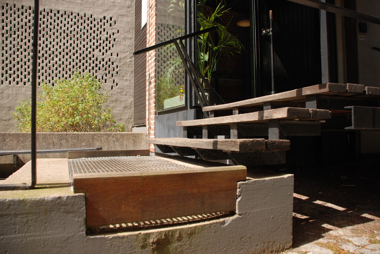
as I said the only part of the construction, related to Nyberg, that touches down is the handrail from -67 and that's only with one upright, and in a very odd way: the upright isn't just secured on top of the stair but turns ninety degrees and follows the stair to spill down the riser like some kind of slow-moving liquid.

this became a lot longer than I had at first intended but since my first visit I have been fascinated by how just a few materials – timber, steel, copper – in even fewer shapes – basically a rectangular cross-section of different proportions – can combine in unexpected ways to create what can only be considered some kind of built poetry.

acknowledgements and further info:
most information on dates and the different alterations are from Lennart Lundberg's 2003 thesis in art history Arkitekten Bernt Nyberg och modernismen –en studie av konst- och musikvetenskapsinstitutionens byggnad "Josephson" vid Lunds universitet which although it, from the perspective of a practising architect, has some flaws is useful on the timeline of the building and the different changes since its completion

Thursday, October 27, 2016

hold time

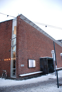
last year I was strolling around Lund and suddenly realised I was just by Bernt Nyberg's County Archive Annex (1971). well, I have been there before, and it wasn't even the first time since it got turned into student accommodation, but it was the first daytime visit since that encounter.

and at first I was a little upset, as a lot of people have been, or maybe not upset but I found it sad and a little annoying that they didn't find any use for the building better suited to its stark brick walls. but afterwards I thought some more about it: for a long time I have had a problem with the profession's attitude towards change and time. always caught between utopian ideals and actual execution the reading architect always encounters buildings at the moment they were just completed: spanking new and without any blemishes. of course, if you actually go to visit buildings you've read about they might have changed but then you can always compare the reality to the, almost platonic, ideal in your mind. in this way you can just ignore anything you don't like, as long as you can rationalise it as being a problem either with the execution or the occupation of the building and not in the building itself (this, of course, is if you believe there is a wrong way to occupy a building, and I would say most architects actually do).

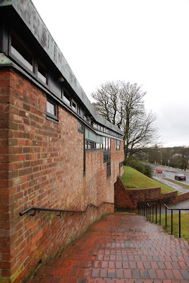
at Mårtenstorget, just a few hundred meters from the archive building, stands Krognoshuset – a building Klas Anshelm left standing when he built Lunds Konsthall next door. this is the oldest profane building in Lund, thought to be dating from the 14th century, and a building whose layered façades I've long liked. and this is what had me thinking: if I approve of the current state of Krognoshuset can I ever justify a dislike of the changes to the archive, at least as long as they're executed in a decent way?

I realised I probably couldn't, because what I in effect wanted to do was to freeze time, to not allow change, just because I liked what was there at the moment. of course you should resist some change – the stupid over exploitation of an existing plot or the kind of renovation that only really serves to drive out current inhabitants – but resisting turning an archive building into student accommodation after it's lost its original purpose? isn't that just the kind of thing that would prevent something like Krognoshuset in 700, or 70, years' time?

well, it might be hard to imagine a contemporary building actually being around for that long but considering the means of construction, hard-fired bricks and a lot of cement in the mortar, in this case there might actually be a small chance.

Sunday, April 29, 2012

monolith

entrance façade, Riksförsäkringsanstalten, Stockholm - Sigurd Lewerentz
a trip to Stockholm two weeks ago had me revisiting some of my favourite buildings from when I used to live there, as well as some of the buildings that have sprung up since I moved away. one of the buildings I went to revisit was Sigurd Lewerentz's severe, rationalist Riksförsäkringsanstalten (1930-32).

I guess I could claim that it was its very familiarity that had me snapping a few photos without really reflecting on the building. at the same time I haven't ever noticed what I saw when later flicking through the photos at home, so it might just be that I'm quite lousy at paying attention.

anyway, Riksförsäkringsanstalten is a monolithic building – a smooth white cube with a painted datum instead of any proper plinth. this white cube is perforated by square windows set deep within the wall creating dark recesses which reinforce the feeling of a homogeneous object with holes punched through it. but something isn't entirely what it seems, when studying the corner more closely you can see that the walls mightn't be as thick as you at first assume.

detail of corner, Riksförsäkringsanstalten, Stockholm - Sigurd Lewerentzat the corner – the place where a traditional building would most assert its solidity – Lewerentz starts playing games: on one side he leaves the part of the wall closest to the corner blank while on the other he pushes the window as close to the corner as is possible. thus the building that looks like a solid block when viewed from Sveavägen and Adolf Fredrik's churchyard is suddenly revealed to be something more akin to a cardboard model when viewed from one of the two side streets. of course it was standard procedure for the early modernists to undermine the solidity of corners – something perhaps started by the glazed corners in Gropius and Meyer's Fagus factory – but the difference this time is the play between the solidity of the monolith and the flimsiness of the cardboard model.

detail of corner, Schulhaus, Paspels - Valerio Olgiati
I have seen the same mannerist games employed in another seemingly solid building: Valerio Olgiati's School in Paspels (1998). the school has an even more restrained material palette than Riksförsäkringsanstalten: it's basically concrete, glass and a brownish metal that might be brass (but which might be something else entirely). when visiting the school it felt a lot like a concrete boulder sitting in an alpine field but at the corners the monolithic appearance is undermined in just the same way as at Riksförsäkringsverket. the main difference to the Lewerentz building is that at the school one window on each side is pushed right up to the corner. this means that neither side gives a more solid impression than the other, instead it depends on what floor you're focusing on.

these tricks are fairly subtle, though. in both cases I have noticed the corners not when actually visiting the buildings but instead while looking at photographs at a later time. it is this duality I find particularly interesting; both buildings are very much one object even if some aspects of them oppose that reading. this can be contrasted with two other buildings which both play with monumentality while at the same time undermining it. in these cases, though, there isn't this dissonance in the reading of the building, instead after the building is revealed as less solid than you at first think it never really regains its monolithic quality.

detail of corner, Lunds konsthall, Lund - Klas Anshelmthe first of these buildings is Klas Anshelm's Lunds Konsthall (1954-57) which employs the same trick but without the ambiguity. when you turn the corner the main façade is revealed as a thin brick slab by a window reaching all the way from the ground up to the roof. walking back to Mårtenstorget to view the front façade again you see a similar window at the left hand side of the building and realise it never actually was a building, instead it is a collection of building elements that just happen to be in the same place.

side façade, Casa del Fascio, Como - Giuseppe Terragni
the other is Giuseppe Terragni's Casa del Fascio (1932) in Como, just south of the Swiss-Italian border. this building has a very similar corner treatment to Riksförsäkringsanstalten but as the main façade also seems to be made up of thin layers the impression is very different. instead of a monolithic building revealed as being paper thin at the corner this is a building seemingly made up of several layers that coalesce into a single form.

Friday, September 09, 2011

lost and found

St. Bride's, East Kilbride - Gillespie Kidd & Coiaso there we were, at 9.30 in the morning, walking through the drizzling rain in a Scottish new town. it was Easter Sunday and we reckoned our best shot at getting into the church would be to try to get in right before mass. this was what we had come here for, the reason we were in this particular part of Europe.

when arriving at the church we slowly pushed the door open and found ourselves in the middle of an ongoing mass; seemingly we had made some error estimating the times. my catholic travel companion urged me to step in, and not really knowing what else to do I followed suit.

bar my grandparents' funerals this was the first time I found myself in a church during service for ten, maybe fifteen, years. being from a not particularly religious background in one of the most secular countries in the world the only reason I've been to church recently has been architectural. but there I was, doing my best to keep up with what was going on, suddenly being told to stand up to shake hands with the people that had been sitting around us. I never knew or had heard about that.

the fact is I've never been to churches as much as I have since starting to study architecture but, as I said, during that time this was only ever the third time I've seen one being used for what it was designed for, and – as the other two times were for my grandfathers' funerals – the first time I was in a state to actually take in what was happening.

after mass ended we were let to roam around the place, taking photos, exploring nooks and hidden corners. then we left by foot heading back towards the train station. on our way there we happened on some old cottages in grey stone (granite, I'd say, but my memory might be playing tricks on me). the cottages were lining a picturesque cobbled street, the whole scene utterly idyllic. this was nothing I had expected - we were in the town that gave birth to the Reid brothers and thus the Jesus and Mary Chain, after all - but it was beautiful indeed. even more so for its contrast with the surroundings.

School house, Paspels - Velrio Olgiatithe more I travel to visit buildings, the more I appreciate unexpected happenings and scenes like these. the moments where you get to see something else, something unexpected. I used to work for a big firm and the study trips the office went on were painstakingly prepared: itineraries prepared by academics, local guides hired, restaurants pre-booked: it was the definition of a professionally organised trip. of course we got to see great buildings - and I assume I picked up a thing or two from those trips - but they were problematic to me in the same way that riding the underground in a strange town is problematic: you never get a sense of coherence, of how things are connected. you visit this one building to then immediately be on your way to the next. and this without really encountering neither the surrounding city nor the community.

not to overstate how much we've managed to take part of the local community when I've been on private trips with friends but at least we've had to rely on the people we encounter to get food, or to find our way. and in places where we've known the language we've suddenly ended up talking to some of the locals (ok, a couple of sentences exchanged with some children up an apple tree in Paspels is hardly a great exchange of views, but at least I know they find the Olgiati extension 'langweilig'). just the fact of being reliant on public transport is a great way of getting to know a city better. you're not just zoomed from one place to the other in your own private bubble but actually encounter people, and other parts of the city, on your way getting to your goal.

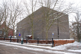
Riksarkivet, Lund - Bernt Nyberga time before moving here I was visiting Malmö and decided to take a trip to Lund to have a closer look at some of Klas Anshelm's work and Bengt Edman's* brutalist student-housing Sparta. walking out of the station towards the Technical university I happened to lose my way. just as I found someone to ask for directions I realised I was standing across the street from Bernt Nyberg's archival building for Landsarkivet, a huge lump of Helsingborg bricks owing quite a lot to Lewerentz's late churches. this is a building I've seen at lectures but had somehow managed to forget about since. and there it was, just in front of me. lucky me! especially as I later found out it's about to be turned into student accomodation, with huge new windows punched through those expanses of brooding brick.

I know I'm always a tourist on any of these trips, just dipping a toe in and never actually taking part in the life around me, but I think that the chance encounters and unplanned distractions have been as important to me as what I've actually planned to go somewhere for, maybe even more so.

* Bengt Edman is, together with Lennart Holm, the architect behind Villa Göth, a building that – according to Swedish architectural lore – is the one that had Hans Asplund (Gunnar's son) characterising it as 'brutalistisk' (or some such phrase, the exact wording is never entirely clear) which is supposedly the starting point for the expression 'the New Brutalism'.

Tuesday, November 30, 2010

bricks and mortar

Town hall in Lund - Klas Anshelmafter a visit to Lund last weekend I suddenly realised the striking similarities between Klas Anshelm's Town hall (1964) and Giancarlo De Carlo's Magistero (1976) in Urbino. having known about both buildings for years and having been very fascinated by De Carlo's since I first saw drawings of it I can't see why it took me this long to realise. even though De Carlo did have contact with Lund through ILAUD in the 80s I haven't found any information suggesting he was aware of Anshelm's building while designing the Magistero.

first and foremost they're both large brutalist buildings in the context of a medieval town* and secondly they're organised in a very similar way: the plan is one huge expanse into which multi-storey bodies housing specific programmes are set leaving the rest of the plan for circulation. in both cases the shapes for the main functions are clearly visible from outside, thus hinting at the functions inside. for his building De Carlo chose to work with non-directional plan shapes like circles and semi-circles while Anshelm deploys the directional mandorla shape for his two most important rooms – the assembly hall and the audtorium. in one way you could make an analogue comparison between the open floor plates of the buildings and the 'western' modernist idea of endless free-flowing space in city planning. in this comparison the multi-storey volumes are seen as buildings.**

19th century map of Lundas well as similarities there are, of course, some major differences, especially in how these buildings relate to the surrounding city. De Carlo's project is built inside an old monastery where the existing brick perimeter walls are retained and thus camouflage the building when seen from the surrounding streets. in Lund Anshelm actually demolished buildings around the existing Town Hall and put a free-standing triangular building in their place. although the triangular shape doesn't align with the geometry of the surroundings it is very appropriate – creating some very nicely proportioned interstitial spaces when you walk around it – and doesn't feel like it ruptures the streetscape.

to the east of Anshelm's building there is a narrow office-building, separated from the Town Hall by a pedestrian path, which is also part of the original scheme and that Anshelm built against an existing firewall. while this side adapts to the constraints of the site the other two work to both separate the new building from the existing Town Hall and to act as a backdrop to the classical building when seen from a distance.

apart from being beautiful pieces of architecture in and of themselves I would say that both buildings serve to show alternative ways for modern buildings to relate to their surroundings without resorting to explicit mimicking. in the case of the Magistero you could claim that its camouflaging is a way of cheating but I would see it ass more of a trojan-horse manoeuvre in that it manages to slip radically modern accommodation into a sensitive medieval context without compromising either context or programme, and there are some modern windows and doors visible from the street that hint at the transformation of the space behind the walls. in the case of the Town Hall it neither simply adapts to the existing street-pattern nor is integrated in the building mass of a bigger city block, instead it is a free-standing volume – in full accordance with modernist dogma – but placed in such a way that it actually improves the existing streets and patterns of movement.


ps. I apologise for the lack of good drawings etc. but at the present all my books are in storage so those pdf:s are what I managed to find online.

* the similarities between brutalism and medieval architecture crept up just a while back in a comment to a post Owen Hatherley did on Southampton. see also the chapter on Scottish tower houses in Andrea Deplaze's Constructing Architecture where he compares their general layout and Louis Kahn's Phillips Exeter Academy Library.

** this 'western' conception of space was the main theme for Gunnar Asplund's inaugural lecture as professor at KTH (the Royal Institute of Technology) in Stockholm. a concept Asplund found in Oswald Spengler's The Decline of the West.