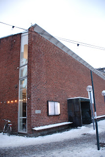
I guess I could claim that it was its very familiarity that had me snapping a few photos without really reflecting on the building. at the same time I haven't ever noticed what I saw when later flicking through the photos at home, so it might just be that I'm quite lousy at paying attention.
anyway, Riksförsäkringsanstalten is a monolithic building – a smooth white cube with a painted datum instead of any proper plinth. this white cube is perforated by square windows set deep within the wall creating dark recesses which reinforce the feeling of a homogeneous object with holes punched through it. but something isn't entirely what it seems, when studying the corner more closely you can see that the walls mightn't be as thick as you at first assume.
 at the corner – the place where a traditional building would most assert its solidity – Lewerentz starts playing games: on one side he leaves the part of the wall closest to the corner blank while on the other he pushes the window as close to the corner as is possible. thus the building that looks like a solid block when viewed from Sveavägen and Adolf Fredrik's churchyard is suddenly revealed to be something more akin to a cardboard model when viewed from one of the two side streets. of course it was standard procedure for the early modernists to undermine the solidity of corners – something perhaps started by the glazed corners in Gropius and Meyer's Fagus factory – but the difference this time is the play between the solidity of the monolith and the flimsiness of the cardboard model.
these tricks are fairly subtle, though. in both cases I have noticed the corners not when actually visiting the buildings but instead while looking at photographs at a later time. it is this duality I find particularly interesting; both buildings are very much one object even if some aspects of them oppose that reading. this can be contrasted with two other buildings which both play with monumentality while at the same time undermining it. in these cases, though, there isn't this dissonance in the reading of the building, instead after the building is revealed as less solid than you at first think it never really regains its monolithic quality.
 the first of these buildings is Klas Anshelm's Lunds Konsthall (1954-57) which employs the same trick but without the ambiguity. when you turn the corner the main façade is revealed as a thin brick slab by a window reaching all the way from the ground up to the roof. walking back to Mårtenstorget to view the front façade again you see a similar window at the left hand side of the building and realise it never actually was a building, instead it is a collection of building elements that just happen to be in the same place.
the other is Giuseppe Terragni's Casa del Fascio (1932) in Como, just south of the Swiss-Italian border. this building has a very similar corner treatment to Riksförsäkringsanstalten but as the main façade also seems to be made up of thin layers the impression is very different. instead of a monolithic building revealed as being paper thin at the corner this is a building seemingly made up of several layers that coalesce into a single form.


