Tuesday, May 30, 2017

to a poet

I'm currently working on a longer post on Bernt Nyberg and while doing some online research I happened on Arkdes' online archive of Nyberg's drawings and models. unfortunately so far few of the listed items have made it online but among the ones that have I found a drawing for the entrance stair and canopy of his Department of Anatomy and Histology Building (currently referred to as the Josephson Building and belonging to the Department of Arts and Cultural Sciences) in Lund from 1965. last year I went by the building for the first time and was immediately struck by two things: first the almost medieval relationship between the entrance stair tower and the neighbouring building to the south east and secondly the way the stair feels both haphazard in detail and entirely planned in the whole. not that the detailing feel haphazard in an unconsidered way, I probably should refer to it as loose fit instead; it is a whole with improvisations where everything is ruled by a main theme

the first thing to say is that seen from the front the stair tower is entirely separated from the main building, both tectonically and in materiality: the main building shows a laconic acceptance of the programme in that it is a white-rendered brick building with repeated fenestration that doesn't in any way try to seem more interesting than it actually is while the stair tower seems to be a picturesque collage of slabs of different materials, not entirely unrelated to neoplasticism. there is an argument to be had that the ninety degrees indentions at the corners of the main block makes it seem like it too is composed of several slabs but even if that is the case the slabs the stair tower is composed of are much more pronounced.

moving down in scale we have the entrance porch and canopy. now we're suddenly quite far from neoplasticism but when looking closer at the different elements it is quite noticeable how everything is constructed from, well, not slabs but from distinctly flat elements: there are timber boards, flat steel bars, copper sheets etc. there is one obvious exception, the concrete stair, but that is also clearly separated from the building and belongs to the earth instead.

one significant characteristic of the porch – though one most users of the building probably won't notice until after a long while, if they notice it at all – is that the whole thing is cantilevered off the stair tower. it would be so incredibly easy to just put some short legs under the construction but there are none. the only places it actually touches down are the handrail of the stair – added by Nyberg in 1967 – and the ramp at the back which wasn't added until 1983, after Nyberg's passing, to increase accessibility. so if you take a look at the drawing there is actually no point of the porch that ever touch down.

after a while you realise that the fact that the construction doesn't touch down is symptomatic as none of the major elements of the porch actually connect to each other either; they're always connected by secondary elements or interrupted by some other part. so you have a thin flat timber roof that rests atop T-shaped steel beams (ostensibly made from two flat steel bars connected at a right angle) but before the roof meets up with the wall of the stair tower it's interrupted by a copper gutter resting on the same beams (and which at the front lets the water just fall straight onto the ground but at the back is connected to a rectangular drainpipe). in the same way the T-shaped beams aren't actually resting on the paired uprights at the edge of the porch, that would be way too obvious a construction, instead the beams lie on top of steel brackets made of folded flat steel bars and these brackets also serve as the distances for the paired uprights. and the original railing, a flat steel bar folded into the shape of a rectangle, is connected to the uprights by the same kind of bracket, only smaller. the floor of the porch is made from timber boards resting on further T-shaped beams which are in turn resting on the steel cantilevers connected to the stair tower. originally the Ts, and the boards along with them, made a ninety-degree turn at the back folding up to make a waist-high back wall where the ramp now starts.
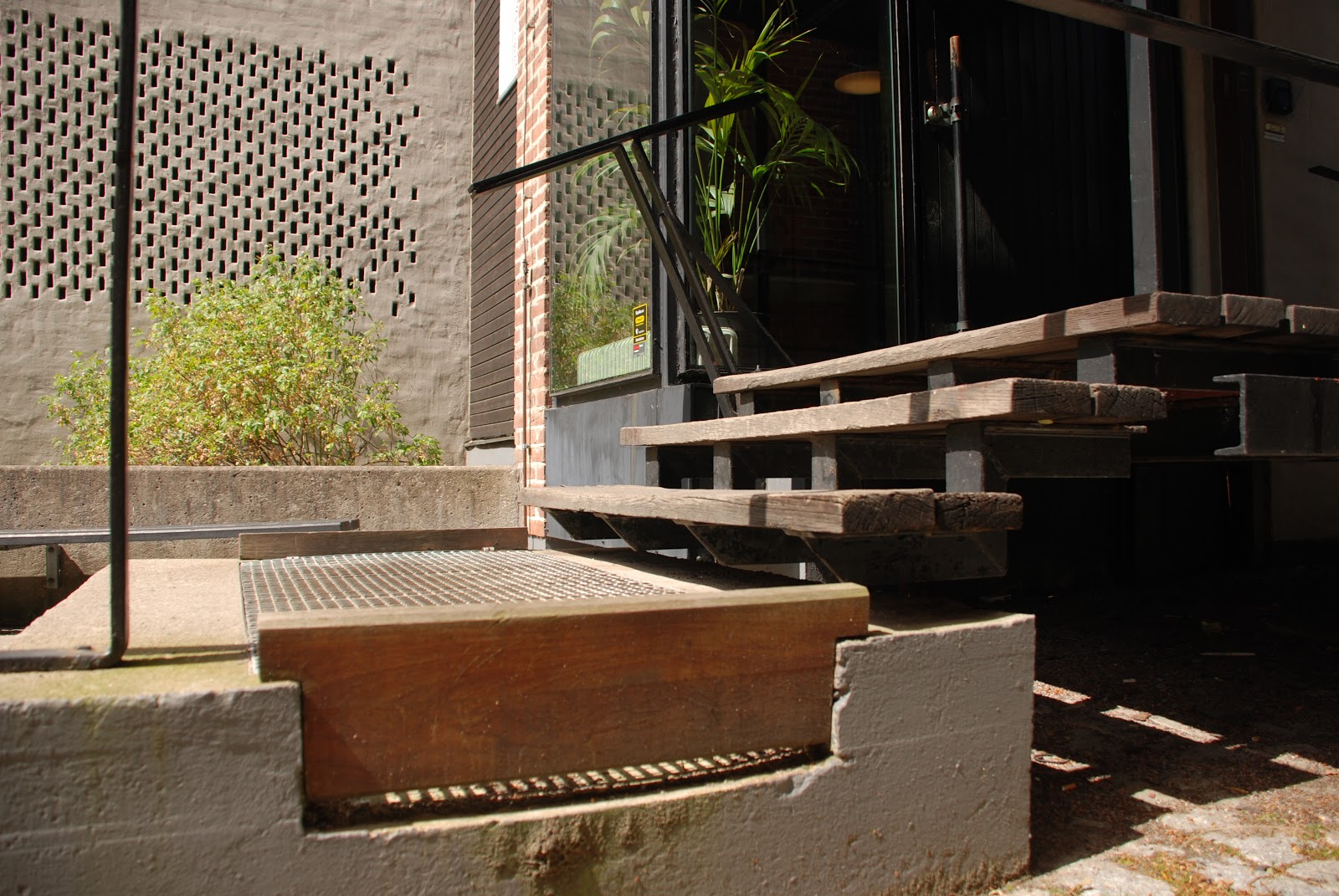
as I said the only part of the construction, related to Nyberg, that touches down is the handrail from -67 and that's only with one upright, and in a very odd way: the upright isn't just secured on top of the stair but turns ninety degrees and follows the stair to spill down the riser like some kind of slow-moving liquid.

this became a lot longer than I had at first intended but since my first visit I have been fascinated by how just a few materials – timber, steel, copper – in even fewer shapes – basically a rectangular cross-section of different proportions – can combine in unexpected ways to create what can only be considered some kind of built poetry.

acknowledgements and further info:
most information on dates and the different alterations are from Lennart Lundberg's 2003 thesis in art history Arkitekten Bernt Nyberg och modernismen –en studie av konst- och musikvetenskapsinstitutionens byggnad "Josephson" vid Lunds universitet which although it, from the perspective of a practising architect, has some flaws is useful on the timeline of the building and the different changes since its completion

Sunday, April 16, 2017

drops in the river

here's a post I started years ago but never got round to finishing, that is until I started reading the reprint of Nairn's London and read this quote in his description of the Monument 'the view makes most sense to a stranger in that – unlike most London views – it shows how the city is completely formed by the river yet has turned its back on it'. this brought to mind another city, at least partially, formed by a river:
 
on new year's eve 2012 a friend asked me what was the highlight for me that year. I instinctively replied that it was swimming in the Rhine through Basel.

I'm fully aware that I had been happier at other moments that year, that I had had more fun, felt more alive and been more excited at other times. I also know there are several other things – most other things, really – that had had a more profound effect on my daily life than those few occasions I drifted in that river looking up at the city around me. but had I felt more at peace with the world and my place in it? probably not. and then I'm more at peace with the world than I've been in a very long time.

of course being on holidays had something to do with it, of course being on holidays after having worked way too much all spring had something to do with it, of course being on holidays after having worked way too much all spring and knowing a new exciting job was waiting on my return home had something to do with it.

it was something more than that, though. something about lazily seeing the world going by, of changing perspective and suddenly being in the thing you normally cross over going somewhere else, that was incredibly relaxing. and the city of Basel has done almost everything right helping people use that great resource of theirs.

I remember my first visit to Basel, three years prior: a friend and I had been on a study trip going from Milan via Como, Bellinzona and Chur looking at beautiful architecture and sublime landscapes. the trip ended in Basel where we had a day to take in all the sights we wanted to see and as the city is littered with interesting architecture we set about it with gusto: driving here, taking a tram there, walking this way and walking that way back. in the end we had managed to rack up an impressive amount of sights – in hindsight I barely understand how we managed to fit it all in while it still felt like a fairly relaxed day – but that time the Rhine was just something we happened to pass on our way somewhere else.

a year later I was back, visiting another friend that had moved there in the meantime, and I realised that far from just being something you cross a lot of the life in the city actually circle around the river; be it the harbour, the medical companies and factories occupying long stretches of the riverbank or the people having a beer out by the river during the evenings.

yes, I know, of course the river as a piece of infrastructure is one of the main reasons there is a city there to start with, but I have never been in a city where the water hasn't been turned into either just a piece of infrastructure or something picturesque you look out on while sipping a coffee or a glass of wine. in Jönköping, my hometown, the lake Vättern is somewhere you can go swimming in summer and a provider of horribly cold northern winds throughout the rest of the year, in Stockholm the heavy traffic on lake Mälaren is routed south of the city leaving the huge expanses of water in the city centre as a picturesque element elevating the prices of apartments while rendering the inner city incredibly cumbersome to get around. but in Basel you have people swimming in the river only 50 meters away from a fully loaded barge, you have that same barge passing the beautiful, current-powered, ferries at a right angle: you have the utterly contemporary and the antiquated and the picturesque co-existing side by side in a way that resembles the city itself.

in this way the quays on the Kleinbasel side with their steps leading down to the water lets you witness the new and old, the beautiful and the ugly as well as leisure and labour all at the same time.

it must be said that the reason we missed most of the river on my first visit was because it is only really on the northern shore, in Kleinbasel, that the city connects with the river. in Groβbasel there is a higher and steeper bank and long rows of houses that hide the river from view in the central parts. the upside of this, from the point of view of the locals at least, is that a lot of the tourists will miss this beautiful stretch of the shore, merely seeing it from one of the bridges or, if they're splashing out on accommodation, while having dinner in a fancy hotel restaurant.

but the residents do flock to the river during summer days: bobbing along in the river – using water-tight bags for their belongings as flotation devices – or having a picnic on the stairs leading down to the water. I guess it makes sense that it's on the northern shore that the city connects with the water as Kleinbasel is traditionally more working class than Groβbasel. and now that things have changed, when connecting to a body of water is suddenly desirable to the middle and upper classes there is the risk of going down the route that London seems to have taken, where the riverside seems to have been taken over by luxury developments, Basel on the other hand have upgraded the quayside making sure it's still a public amenity and all along the river is still used for transporting goods and people. no use is forcing the others out, instead they're all co-mingling – seemingly happily. in a way I guess Copenhagen have tried something similar in the way they've built their harbour baths, but they are only tiny spots in a strait, in Basel it's a stretch of water all through the inner city dedicated just to swimmers.

if I were to guess the fact that the river is harder to reach on the southern side is a huge part in the fact that different uses can co-exist as the natural conditions for swimming is missing along the Groβbasel shore so that whole side of the river can be reserved for traffic while the northern two fifths can be turned over to recreation.

the city seems to have done some work to the quayside infrastructure over the last decades which has turned out great (it seems the only reason anyone could possibly have to complain is if you're a drummer wanting to practice the bongos, but in that case I think the rest of the people there are thankful for the ban).

of the cities I've visited Basel is the one that most successfully relates to the water it's situated at; and still I entirely missed the river on my first visit. but I'm not sure it's just a negative thing that tourists miss some spots, at least not from the perspective of the locals.

well, in all honesty we've got something similar here in Malmö, at least in parts of the city: first there's the long sandy beach and the open-air baths at Ribersborg as well as the promenade with steps leading down to the water at Västra hamnen but they're on the outskirts of the city, and Västra hamnen is a very expensive part of town. thankfully that hasn't stopped people appropriating the promenade there and a lot of people from other parts of the city go there for a barbecue and to hang out on summer evenings but compared to Basel it is still peripheral and like in most cities the productive uses of the sea are spatially separated from the recreational ones. so in Ribersborg and Västra Hamnen the sea is a picturesque recreational amenity (and occasional cause of harsh climatic conditions) while in Mellersta and Norra hamnen it's still just infrastructure if, admittedly, picturesque at times. of course you can argue that this is the luxury of having a lot of water, you don't need uses to juxtapose, but I can't help but to think that the city is actually poorer for it.

let's end with a photo of the sun setting behind Groβbasel, a perfect view at the end of a summer's day.

Monday, January 16, 2017

overcome with light, pt. 2


I have just read Johan Mårtelius' essay Längs bokens rygg (Arkitektur (Stockholm), no. 4, 2006) where he mentions the progression from darkness towards light connecting it both to the entrance sequence in Isak Gustaf Clason's Nordic Museum and to the line 'Från mörkret stiga vi mot ljuset' (From the dark we step towards the light) from the Swedish version of The Internationale.

Mårtelius also mentions that the third, modernist, wing – directly in front as you come up the entrance stair – wasn't added until 1932 so originally you were facing a glazed opening with a door leading straight out into the even brighter daylight outside. I hadn't actually thought about it like that, and find it a little disappointing that if you follow that reasoning there is a distinct spatial direction to your progress: you do not see the same spot in a new light but encounter something actually new instead. even though that too works as a spatial metaphor for learning I'm actually quite happy that third wing was added so quickly - it makes the building a bit more didactic and explicit but it also adds something by forcing you to enter and exit in the same way (well, there are other ways of entering and exiting but they are more obviously secondary so don't really matter that much to the entrance sequence).

Thursday, October 27, 2016

hold time

last year I was strolling around Lund and suddenly realised I was just by Bernt Nyberg's County Archive Annex (1971). well, I have been there before, and it wasn't even the first time since it got turned into student accommodation, but it was the first daytime visit since that encounter.

and at first I was a little upset, as a lot of people have been, or maybe not upset but I found it sad and a little annoying that they didn't find any use for the building better suited to its stark brick walls. but afterwards I thought some more about it: for a long time I have had a problem with the profession's attitude towards change and time. always caught between utopian ideals and actual execution the reading architect always encounters buildings at the moment they were just completed: spanking new and without any blemishes. of course, if you actually go to visit buildings you've read about they might have changed but then you can always compare the reality to the, almost platonic, ideal in your mind. in this way you can just ignore anything you don't like, as long as you can rationalise it as being a problem either with the execution or the occupation of the building and not in the building itself (this, of course, is if you believe there is a wrong way to occupy a building, and I would say most architects actually do).

at Mårtenstorget, just a few hundred meters from the archive building, stands Krognoshuset – a building Klas Anshelm left standing when he built Lunds Konsthall next door. this is the oldest profane building in Lund, thought to be dating from the 14th century, and a building whose layered façades I've long liked. and this is what had me thinking: if I approve of the current state of Krognoshuset can I ever justify a dislike of the changes to the archive, at least as long as they're executed in a decent way?

I realised I probably couldn't, because what I in effect wanted to do was to freeze time, to not allow change, just because I liked what was there at the moment. of course you should resist some change – the stupid over exploitation of an existing plot or the kind of renovation that only really serves to drive out current inhabitants – but resisting turning an archive building into student accommodation after it's lost its original purpose? isn't that just the kind of thing that would prevent something like Krognoshuset in 700, or 70, years' time?

well, it might be hard to imagine a contemporary building actually being around for that long but considering the means of construction, hard-fired bricks and a lot of cement in the mortar, in this case there might actually be a small chance.

Wednesday, January 07, 2015

overcome with light

Stockholm Public Library with reflecting pool - Gunnar Asplundthe Swedish noun upplysning has three meanings:

1. information, explanation

2. lighting, illumination

3. enlightenment (and in the definitive form upplysningen it's also the Age of Enlightenment)

in this way - in Swedish - illumination and lighting is intrinsically linked with the mental act of enlightenment. or you could state it the other way round: the mental act of enlightenment is intrinsically linked with the physical phenomenon of light. this has been given the most basic and literal architectural form in Gunnar Asplund's Public Library in Stockholm.

let's take a short walk through the building to see just how:

podium stair, Stockholm Public Library - Gunnar Asplund
when approaching the building on Sveavägen you're met by a long stair leading up a podium on which the actual building is placed. you walk towards the faux-Egyptian entrance opening within which the entrance door is set. originally the door was a hinged, in the 50's changed to a storm door and finally in the late 70's to the revolving door that's still in use.

entrance hall, Stockholm Public Library - Gunnar Asplund
inside is the entrance hall: a high room with dark walls in a sort of stucco lustro (technically they're 'kalkspacklade' but I'm afraid I don't know the exact term in English) adorned by Ivar Johnsson's low-reliefs of scenes from the Illiad. in front of you is a drum pierced by another Egyptian portal while to either side of the drum a curving stair runs up into darkness. the Egyptian portal opens to a stair leading on towards a bright room one story up.

central hall, Stockholm Public Library - Gunnar Asplund
continuing up the stair you find yourself in the middle of a high white drum the lower parts of which are lined with bookshelves and with a top pierced by high windows marching steady all around the drum.

this is the centre of the library, from here you can continue in several different ways depending on what you're looking for: you can make your way up the shelves running around the drum or you can go to the reading rooms and specialist collections in any of the four wings.
exit stair, Stockholm Public Library - Gunnar Asplund
when you later want to leave the library and make the reverse journey you did on your entry everything's suddenly inverted: the bright drum you encountered before is revealed to be dark and dreary compared to the bright light coming up the entrance stair (also note the, non-original, bust of August Strindberg on the top floor misaligned compared to the stair but aligned with the doors on the floor below).


exit hall, Stockholm Public Library - Gunnar Asplundas you walk down those stairs you're constantly able to see out through the glazed entrance portal and upon reaching the bottom step you find that what was a dark and somewhat oppressive entrance hall is suddenly a bright exit hall with light bouncing off the shiny walls and even the ceiling.

continuing out through the revolving door you're back in the same spot where you started from, exactly the same but having been subjected to some both literal and figurative upplysning since last.

you could find this analogy a little cheesy and over-didactic (well, assuming this was actually how Asplund thought about the project, something I haven't got a clue about) but there is no way of denying that the way the different rooms change their appearance and mood depending on if you're entering or exiting the building is plain masterful.


Wednesday, June 26, 2013

people folk, pt. 2

exterior view Folkets hus, Stockholm - Sven Markelius
another spring, another visit to Stockholm. this time I managed to get in to Folkets hus so here are some further photos to add to the below post.


entrance foyer Folkets hus, Stockholm - Sven Markeliusentrance foyer


cloakrooms Folkets hus, Stockholm - Sven Markeliuscloakrooms


upper foyer Folkets hus, Stockholm - Sven Markelius
upper foyer


Wednesday, July 18, 2012

people folk

update January 5, 2013 : I finally managed to scan the drawings so I've changed them to proper scans instead of the previous photos.

in a way that's becoming far too common I have recently been working a bit too much to actually manage to write anything, but here's a post I started ages ago and have finally finished:

detail of the façade of Folkets hus, Stockholm - Sven Markeliusin the social-democratic heartland of Stockholm, on the northern side of Norra Bantorget, there stands a slick 1950's office building: a shiny black labradorite wall with hardwood windows – mid-century modernism at its most corporate. but looks deceive, the most extraordinary things are hidden behind that façade: a jumble of caves, stairs, bridges, cantilevering ledges and raking floors; it's a veritable Piranesian etching – well, as seen through a high-modernist prism, of course.

when viewed from outside there's really only one thing that's hinting at something unusual being found inside: at first-floor level a huge concrete canopy decorated by abstract sculptures extends out over the pavement. that canopy makes for a surprising addition to an office building.

in a way the building's sober façade could be read as an example of Adolf Loos' theories of masks. or rather it could if only the sober modernism had stopped at the front door to be replaced with something more thrilling and over the top inside, but this just isn't that kind of a building. what it is, though, is a building of much greater complexity than you might expect when first seeing it from afar, and that complexity is best illustrated by taking a look at the section:

section Folkets hus, Stockholm - Sven Markelius


behind that office building there lies two huge voids, one on top of the other. in a way the building is almost like something from OMA's late eighties: generic façades and heroically scaled construction used to create vast spaces where no-one would at first expect them.

front elevation of Folkets hus, Stockholm - Sven Markeliusthis is Folkets hus (1951-60) in Stockholm by Sven Markelius (1889-1972), professor of city planning at KTH and one of the architects on the board for the UN complex in New York. Markelius has been largely ignored for the last while, eclipsed by his contemporaries Gunnar Asplund and Sigurd Lewerentz. he was a friend of both Asplund's and Alvar Aalto's (whom he introduced to CIAM) and was one of the major Swedish architects during his life, not least because of his role as planning director in Stockholm. internationally he's probably best known for his own house, used as illustration of the AR-article 'The New Empiricism'. Markelius had lots of connections in the Social Democratic Party – for example he designed the house of Gunnar and Alva Myrdal – and I assume that is how he ended up with the commission for Folkets hus. I'd like to see Folkets Hus as his greatest building, it's at least his most odd and weird one.

rear elevation of Folkets Hus, Stockholm - Sven Markeliuswhen the association running Folkets hus decided to demolish its 1901 building and replace it with a bigger it tried to buy up as much of the surrounding land as possible. despite this the plot ended up at only 4 250 Sqm. because of the relatively small plot the two main spaces of the program – a 750-seat theatre and a 1 500-seat congress hall – had to be stacked on top of each other in the middle of the plot with offices making up the two blocks lining the surrounding streets. well, that isn't entirely true as part of the building along Wallingatan (at the northern side of the plot) is taken up by the fly-tower of the theatre - something which obviously renders an active relationship between the building and the street quite tricky. on the other hand the street frontage towards Barnhusgatan makes up for it somewhat as it houses the main entrance for the theatre and the conference hall and a separate entrance for the first-floor restaurant as well as two entrances for the offices on the floors above.

plans of theatre and banquetting hall, Folkets hus, Stockholm - Sven Markelius
it seems now might be the time to talk about those two voids – or caves as I called them in the beginning – the theatre and the conference hall. it's actually only the theatre that merits to be called cave-like: hidden away deep in both plan and section and with zigzagging walls of red brick there is something very earthbound about the space. the white walls and black ceiling studded with round lights of the conference hall on the other hand is reminiscent of an outdoor space in the city a star studded night, in that way related to the auditorium in Asplund's Skandia cinema from 1923. both the theatre and the conference hall play up the theatricality but aim for different associations: the dark cave with the opening through which you observe the world and the agora - the birthplace of democracy.

plans of ground floor and first floor, Folkets hus, Stockholm - Sven Markelius
connecting and flowing between these two spaces are two lobbies. the entrance lobby is the logistical heart of the building: straight ahead a gap gives a view of the theatre's foyer half a storey below while the rising ceiling hints at the route up to the conference hall. the stairs to reach these other rooms are situated at either side of the gap.* if you ascend the stairs you reach the corridor-like cloakrooms for the conference hall. sandwiched between the theatre and the conference hall the walls separating these cloakrooms double up as beams of immense dimensions making sure no columns are needed in either room.

plans of restaurant level and conference level, Folkets hus, Stockholm - Sven Markelius
the foyer for the conference hall is a wide and bright space lit from a south-facing roof-light along the back wall. having arrived here, looking at the interior wall of the theatre's fly-tower, the visitor is encouraged to make two ninety-degrees turns and end up facing the curving back wall of the conference hall. this foyer has some elements in common with the entrance foyer: the gap, a ledge-like balcony and the symmetry. the two rooms are clearly related and are key to making the building function in such an easy way as it does.

I began by claiming that Folkets hus was akin to but not quite adhering to the theories of Adolf Loos. while writing this post I've had to revise that opinion, it's entirely like a larger version of a Loos villa. all the elements are there: the elaborate section, the symmetry of all major rooms, the interior decoration meant to create different moods in different rooms, the meandering and staged communication  – even the tucked away communication for staff/workers.

I've liked Folkets hus ever since I first visited it during first year in college but for different reasons. what most attracts me at the moment is that it's such a complex building but that that complexity is not based on knowing references to historical precedents nor is it an over-complicated skin stretched over a banal stacking of identical floors, no it is a building with a simple and unassuming language used to render the actual complexity of the building as easy and intuitive as possible. it's a very confident building and it's basically the antithesis of almost anything that is being built in present-day Sweden, and for that reason alone well worth remembering and celebrating.

* this set up could be seen as an evolution of the gap in the procession in Markelius' first modernist public building – the Helsingborg Concert Hall – where visitors encounter a half-storey change of level that forces them to make a ninety degree turn up some stairs into the coat rooms before getting back to the main corridor to continue towards the hall (see the cut-away model here). though in this case, as there are two main halls, the continuous ceiling and the falling away floor leads to one hall each.

acknowledgements:
all drawings are taken from the magazine Arkitektur no. 6 -1961.

Sunday, April 29, 2012

monolith

entrance façade, Riksförsäkringsanstalten, Stockholm - Sigurd Lewerentz
a trip to Stockholm two weeks ago had me revisiting some of my favourite buildings from when I used to live there, as well as some of the buildings that have sprung up since I moved away. one of the buildings I went to revisit was Sigurd Lewerentz's severe, rationalist Riksförsäkringsanstalten (1930-32).

I guess I could claim that it was its very familiarity that had me snapping a few photos without really reflecting on the building. at the same time I haven't ever noticed what I saw when later flicking through the photos at home, so it might just be that I'm quite lousy at paying attention.

anyway, Riksförsäkringsanstalten is a monolithic building – a smooth white cube with a painted datum instead of any proper plinth. this white cube is perforated by square windows set deep within the wall creating dark recesses which reinforce the feeling of a homogeneous object with holes punched through it. but something isn't entirely what it seems, when studying the corner more closely you can see that the walls mightn't be as thick as you at first assume.

detail of corner, Riksförsäkringsanstalten, Stockholm - Sigurd Lewerentzat the corner – the place where a traditional building would most assert its solidity – Lewerentz starts playing games: on one side he leaves the part of the wall closest to the corner blank while on the other he pushes the window as close to the corner as is possible. thus the building that looks like a solid block when viewed from Sveavägen and Adolf Fredrik's churchyard is suddenly revealed to be something more akin to a cardboard model when viewed from one of the two side streets. of course it was standard procedure for the early modernists to undermine the solidity of corners – something perhaps started by the glazed corners in Gropius and Meyer's Fagus factory – but the difference this time is the play between the solidity of the monolith and the flimsiness of the cardboard model.

detail of corner, Schulhaus, Paspels - Valerio Olgiati
I have seen the same mannerist games employed in another seemingly solid building: Valerio Olgiati's School in Paspels (1998). the school has an even more restrained material palette than Riksförsäkringsanstalten: it's basically concrete, glass and a brownish metal that might be brass (but which might be something else entirely). when visiting the school it felt a lot like a concrete boulder sitting in an alpine field but at the corners the monolithic appearance is undermined in just the same way as at Riksförsäkringsverket. the main difference to the Lewerentz building is that at the school one window on each side is pushed right up to the corner. this means that neither side gives a more solid impression than the other, instead it depends on what floor you're focusing on.

these tricks are fairly subtle, though. in both cases I have noticed the corners not when actually visiting the buildings but instead while looking at photographs at a later time. it is this duality I find particularly interesting; both buildings are very much one object even if some aspects of them oppose that reading. this can be contrasted with two other buildings which both play with monumentality while at the same time undermining it. in these cases, though, there isn't this dissonance in the reading of the building, instead after the building is revealed as less solid than you at first think it never really regains its monolithic quality.

detail of corner, Lunds konsthall, Lund - Klas Anshelmthe first of these buildings is Klas Anshelm's Lunds Konsthall (1954-57) which employs the same trick but without the ambiguity. when you turn the corner the main façade is revealed as a thin brick slab by a window reaching all the way from the ground up to the roof. walking back to Mårtenstorget to view the front façade again you see a similar window at the left hand side of the building and realise it never actually was a building, instead it is a collection of building elements that just happen to be in the same place.

side façade, Casa del Fascio, Como - Giuseppe Terragni
the other is Giuseppe Terragni's Casa del Fascio (1932) in Como, just south of the Swiss-Italian border. this building has a very similar corner treatment to Riksförsäkringsanstalten but as the main façade also seems to be made up of thin layers the impression is very different. instead of a monolithic building revealed as being paper thin at the corner this is a building seemingly made up of several layers that coalesce into a single form.

Wednesday, January 11, 2012

poor old soul, pt. 1

'I do not need to draw my designs. A good architectural concept of how something is to be built can be written down. The Parthenon can be written down.' Adolf Loos, 1924

I've, once again, been reading up on Loos, and the above quote had me starting to dwell on a favourite issue of mine: CAD-programs, representation and the way people invest hopes and expectations for the evolution of architecture in the evolution of the programs.

I was born in 1981, my dad bought a Commodore 64 some time in the late eighties and my family got a PC some time around 1992-93. this means I have been using computers practically daily for twenty years and sporadically for years before that. I can see how they have sped up processes and how and why they have changed society profoundly: making sure useful information is there at our disposal at every conceivable time, making sure sharing information goes in an instant, also making sure we can always find something to distract us from the dullness of waiting.

but what I can't see, what I just can't comprehend, is how and what in the use of BIM-programs will revolutionise the building industry. I see these 60-year old men telling me about the fantastic advantages of using BIM, and I just look at them and wonder what exactly it is they think these programs do. and then I take another long look at them and wonder if they have forgotten that what we draw is being built by construction workers rather than robots? because we still need to send off drawings as they're the most useful tool to have on a building site. I guess it would be somehow different if what we were trying to build would be some extreme versions of Loos' Raumplan-concept but generally modern day accessibility guidelines makes that harder than it used to be.*

so mostly we're dealing with rectangular floors and rectangular sections built by humans who can guarantee the placement of a pillar down to an accuracy of +-25mm. and these men think we need to spend time building it all, every little part of the building, in three dimensions on our computer screens before it is actually constructed? obviously it is handy when sorting out where different pipes and such collide, but as a tool to create better buildings? wouldn't it just be simpler and cheaper to make sure construction workers are working more quickly and correctly?

as CAD-programs go I like Revit over Autocad (even for just drawing 2d-lines in), but in its current form it won't revolutionise the built environment, and it won't revolutionise the practice of building or architecture. and that's because the problems with today's buildings aren't really to do with problems of sharing information between consultants and builders - that is a minor issue, at the most - the problems with today's buildings are, as always, a lack of craftsmanship, a lack of money and - most importantly - a lack of ideas. and good ideas don't need 3-dimensional representations in computers, as Loos points out ideas can be written down.


*OMA have tried to update that concept to sometimes striking results as can be seen in their Dutch Embassy in Berlin and Casa da Musica in Porto, but these buildings are quite the exception in a world where stacked floors - offset by the same distance - reign virtually supreme.

Wednesday, December 21, 2011

flipside of a memory

this is quite the weird thing: a monument to a monument.

so no longer are the deaths of Rosa Luxemburg and Karl Liebknecht themselves the only thing worth remembering, instead the fact that a monument by the world-renowned architect Ludwig Mies van der Rohe once stood on this spot is seen as as important.

Wednesday, November 16, 2011

london, london

concrete walkways in the Barbican Estate, London - Chamberlin, Powell and Bonjust a quick note on some recent reading:

as I've noted before I like Rowan Moore's writing in the Observer a lot and last weekend he wrote yet another very good piece, this time on the differences between public and private space, especially in relation to the City of London.

and while on that subject - the City of London, that is - here is Bob Stanley, of Saint Etienne fame, on the proposed system of elevated walkways meant to reach most parts of the Square Mile. of the parts that were built there's not very much that is still in use bar the walkways through the fantastic concrete maze that is the Barbican.

Sunday, October 30, 2011

from a balance beam (pt. 2)

writing about churches, structure, decoration and crosses brought to mind this photo of a church in my hometown Jönköping.

from a balance beam

seemingly unable to finish anything bar voluminous Victorian novels it's been more than a month since my last entry. I really wish it was because of lack of ideas, but fear it is more to do with laziness as I've started writing several posts in the meantime but just haven't managed to finish any of them. anyway here's a minor reflection on Swedish vernacular and Sigurd Lewerentz:

two weekends ago I happened to stumble on this advanced pillar-beam construction while walking around some farm buildings near my grandmother's.

I'm quite surprised I haven't seen the T before, I mean I've been running around near that barn since I was a little boy, but never have I noticed that pillar.

St. Peter's church, Klippan - Sigurd Lewerentzit's nine years since I first visited Lewerentz's St. Peter's church in Klippan and during that time I've read about that extraordinary T-shaped pillar a couple of times. in his Modern Architecture Through Case Studies Peter Blundell-Jones writes about the T as a cross, and it probably is – it is positioned in the middle of a church, after all – but it seems it is also a traditional way of supporting loads from two beams when there might be practical reasons to use just one pillar.

Friday, September 09, 2011

lost and found

St. Bride's, East Kilbride - Gillespie Kidd & Coiaso there we were, at 9.30 in the morning, walking through the drizzling rain in a Scottish new town. it was Easter Sunday and we reckoned our best shot at getting into the church would be to try to get in right before mass. this was what we had come here for, the reason we were in this particular part of Europe.

when arriving at the church we slowly pushed the door open and found ourselves in the middle of an ongoing mass; seemingly we had made some error estimating the times. my catholic travel companion urged me to step in, and not really knowing what else to do I followed suit.

bar my grandparents' funerals this was the first time I found myself in a church during service for ten, maybe fifteen, years. being from a not particularly religious background in one of the most secular countries in the world the only reason I've been to church recently has been architectural. but there I was, doing my best to keep up with what was going on, suddenly being told to stand up to shake hands with the people that had been sitting around us. I never knew or had heard about that.

the fact is I've never been to churches as much as I have since starting to study architecture but, as I said, during that time this was only ever the third time I've seen one being used for what it was designed for, and – as the other two times were for my grandfathers' funerals – the first time I was in a state to actually take in what was happening.

after mass ended we were let to roam around the place, taking photos, exploring nooks and hidden corners. then we left by foot heading back towards the train station. on our way there we happened on some old cottages in grey stone (granite, I'd say, but my memory might be playing tricks on me). the cottages were lining a picturesque cobbled street, the whole scene utterly idyllic. this was nothing I had expected - we were in the town that gave birth to the Reid brothers and thus the Jesus and Mary Chain, after all - but it was beautiful indeed. even more so for its contrast with the surroundings.

School house, Paspels - Velrio Olgiatithe more I travel to visit buildings, the more I appreciate unexpected happenings and scenes like these. the moments where you get to see something else, something unexpected. I used to work for a big firm and the study trips the office went on were painstakingly prepared: itineraries prepared by academics, local guides hired, restaurants pre-booked: it was the definition of a professionally organised trip. of course we got to see great buildings - and I assume I picked up a thing or two from those trips - but they were problematic to me in the same way that riding the underground in a strange town is problematic: you never get a sense of coherence, of how things are connected. you visit this one building to then immediately be on your way to the next. and this without really encountering neither the surrounding city nor the community.

not to overstate how much we've managed to take part of the local community when I've been on private trips with friends but at least we've had to rely on the people we encounter to get food, or to find our way. and in places where we've known the language we've suddenly ended up talking to some of the locals (ok, a couple of sentences exchanged with some children up an apple tree in Paspels is hardly a great exchange of views, but at least I know they find the Olgiati extension 'langweilig'). just the fact of being reliant on public transport is a great way of getting to know a city better. you're not just zoomed from one place to the other in your own private bubble but actually encounter people, and other parts of the city, on your way getting to your goal.

Riksarkivet, Lund - Bernt Nyberga time before moving here I was visiting Malmö and decided to take a trip to Lund to have a closer look at some of Klas Anshelm's work and Bengt Edman's* brutalist student-housing Sparta. walking out of the station towards the Technical university I happened to lose my way. just as I found someone to ask for directions I realised I was standing across the street from Bernt Nyberg's archival building for Landsarkivet, a huge lump of Helsingborg bricks owing quite a lot to Lewerentz's late churches. this is a building I've seen at lectures but had somehow managed to forget about since. and there it was, just in front of me. lucky me! especially as I later found out it's about to be turned into student accomodation, with huge new windows punched through those expanses of brooding brick.

I know I'm always a tourist on any of these trips, just dipping a toe in and never actually taking part in the life around me, but I think that the chance encounters and unplanned distractions have been as important to me as what I've actually planned to go somewhere for, maybe even more so.

* Bengt Edman is, together with Lennart Holm, the architect behind Villa Göth, a building that – according to Swedish architectural lore – is the one that had Hans Asplund (Gunnar's son) characterising it as 'brutalistisk' (or some such phrase, the exact wording is never entirely clear) which is supposedly the starting point for the expression 'the New Brutalism'.